Black is Truly Beautiful with these 10 Dark Email Designs
When Facebook introduced its dark mode in Messenger, all other social networking sites followed suit.
As a result, dark email designs were born and have gained popularity in recent years. Even if new subscribers see your emails in their default brighter color scheme, dark designs can help your email stand out.
What exactly is dark mode?
Dark mode is a setting on most smartphones and email apps that changes the colors in an email to a darker, easier-on-the-eyes version. Dark mode is now available in Apple, Outlook, and Gmail’s desktop and mobile apps.
Dark mode email and apps provide a different option. Instead of adjusting the white hue, simply change the entire theme to black or dark gray to eliminate harmful blue light – simple as that.

Because dark mode email and apps provide a unique experience, several popular apps, including Reddit, Facebook Messenger, Twitter, Viber, WhatsApp, and Skype, include built-in dark mode options.
Why are so many people drawn to dark mode?
Dark mode email and apps can also help reduce battery consumption in devices with OLED screens. Dark pixels on OLED screens are not illuminated because they are black. However, the dark pixels on LCD and standard LED screens still require battery life.
Take a look at the brands that have embraced the dark side of technology and development.
Marvel
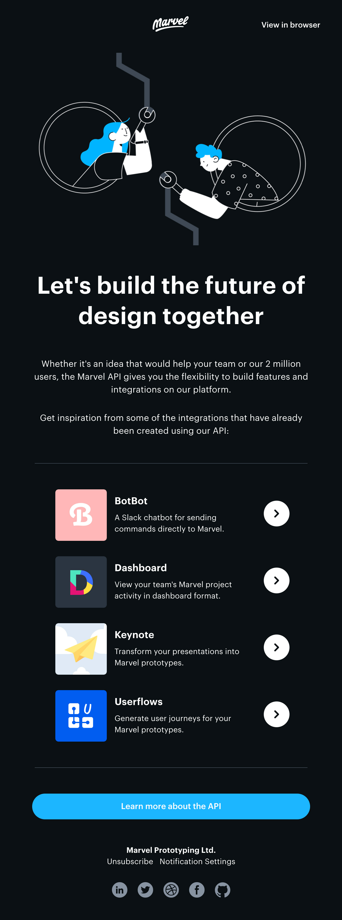
Marvel, one of the best design platforms, contacts developers in this well-crafted email to discuss working with their clients.
Marvel uses a dark background with white custom illustrations and highlights in a bright, friendly blue—a stunning combination that stands out in the inbox.
ReMarkable
Black Friday allows designers to experiment with dark styles while promoting themed deals. ReMarkable, which makes a writing and drawing device, promotes their product with bold typography and negative space.
The orange CTAs add a splash of color to this otherwise straightforward design. The end result is an eye-catching email design.

Eight Sleep
Eight Sleep promotes temperature control products to help people sleep better. The dark background with cool blue highlights creates a peaceful nighttime scene, ideal for promoting products that keep you cool at night.

Designmodo
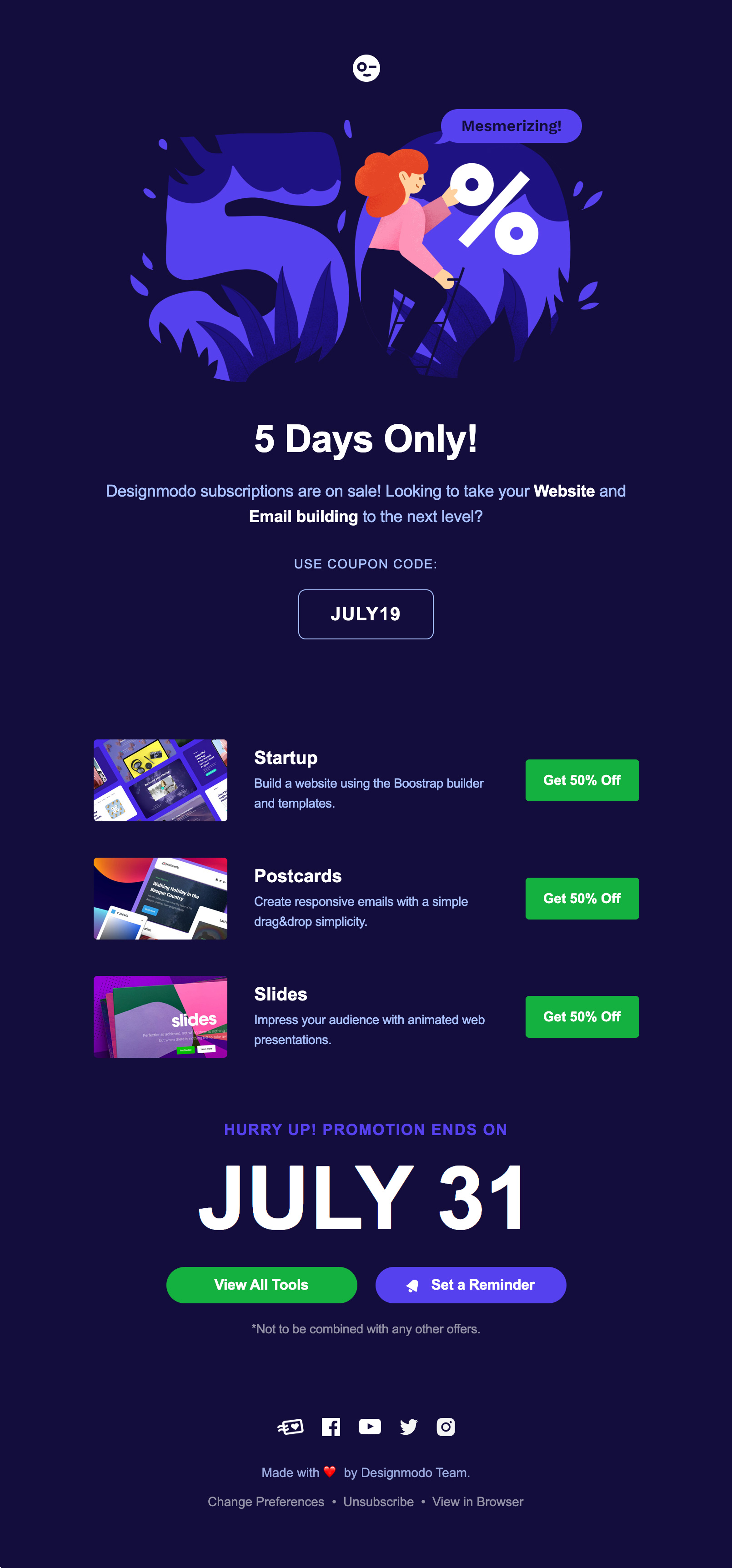
You don’t have to use black and white to use dark styles. In fact, presenting more than a single paragraph of text in pure white (#FFFFFF) against pure black (#000000) is known to strain the eye.
You don’t even have to limit yourself to shades of grey. This lovely campaign is created by Designmodo using various dark and light blue tones.
Equal Parts
Equal Parts’ brand palette includes a number of bold colors that stand out against the dark backgrounds of their email designs. In this loyalty campaign, they use the power of their bold color palette to transport the reader on a journey, providing a fun, digestible, and visually appealing way to learn about their referral program.

The New York Times
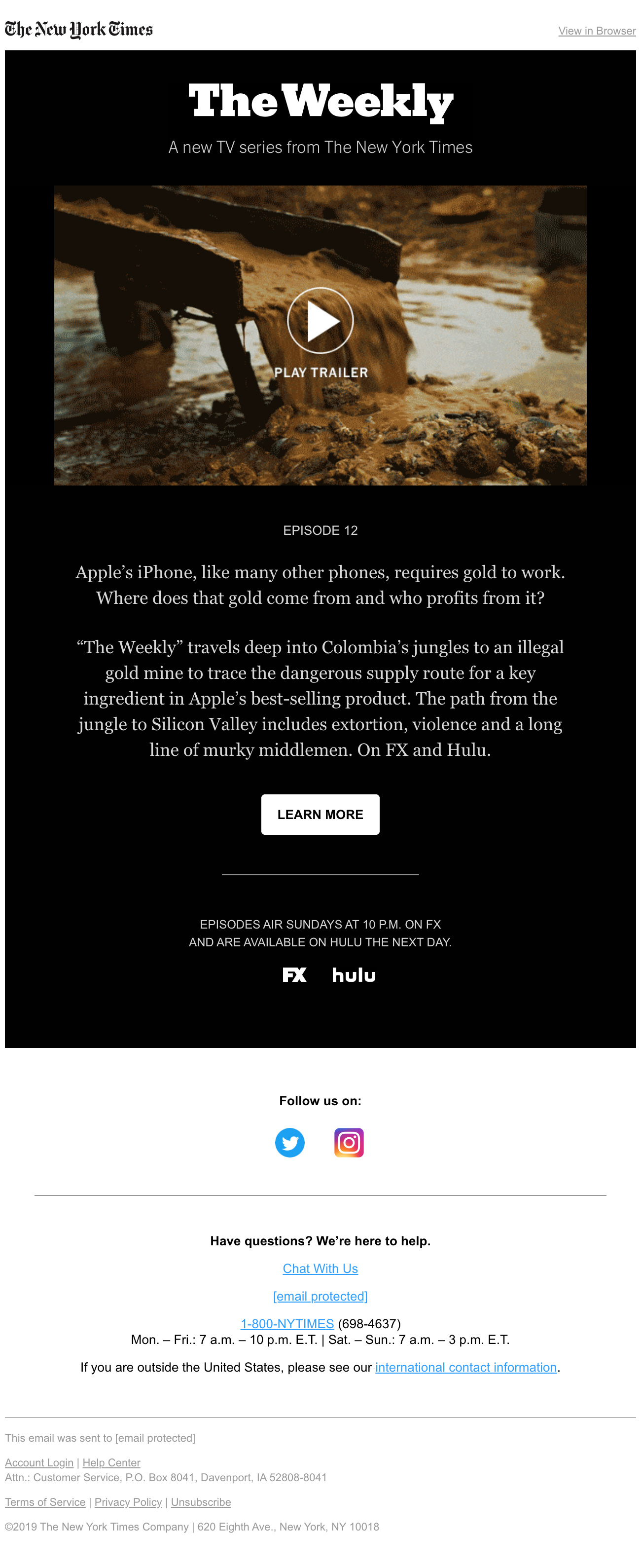
Dark designs can be friendly and fun when combined with bright, vivid colors. Dark styles, however, can set a completely different mood and evoke very different emotions when paired with more muted colors.
The New York Times’ campaign uses a dark style to create a gloomy, serious look that’s perfect for their new TV series documenting troubling topics.
Hulu
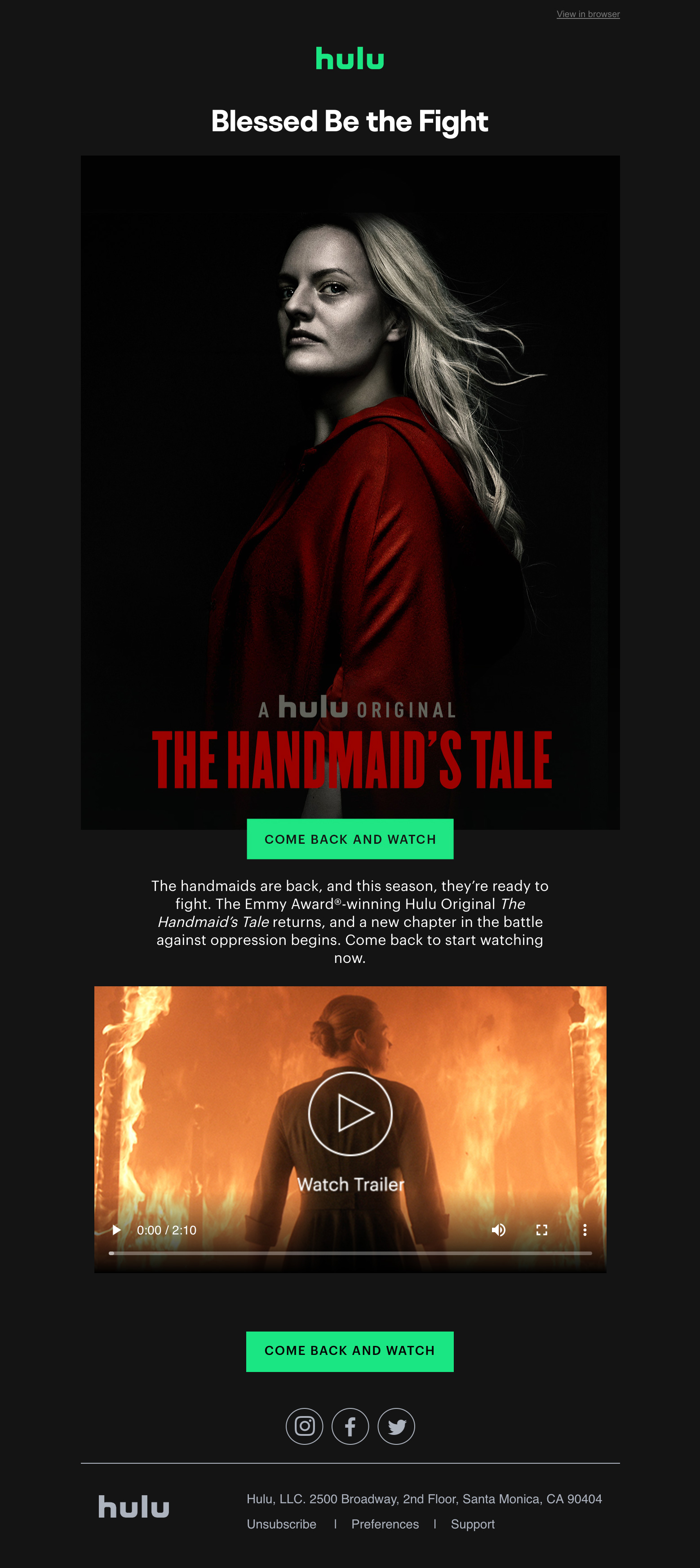
Dark styles are frequently used to promote TV and film, such as this example from Hulu for The Handmaid’s Tale.
Because this is a dark and gripping drama, it would be lost if it were framed within an email with a bright background. Instead, the dark design creates intrigue and atmosphere, enticing the reader to “return and watch.”
Bellroy Premium
Because dark colors are often associated with elegance and formality, brands looking to give their campaigns a premium look and feel should consider using a dark color palette.
Check out this Bellroy, an Australian accessory brand, campaign. Bellroy’s design team harnesses the power of a dark background, beige-golden hues, and a serif font to create a high-end look that’s ideal for promoting their premium range of accessories.

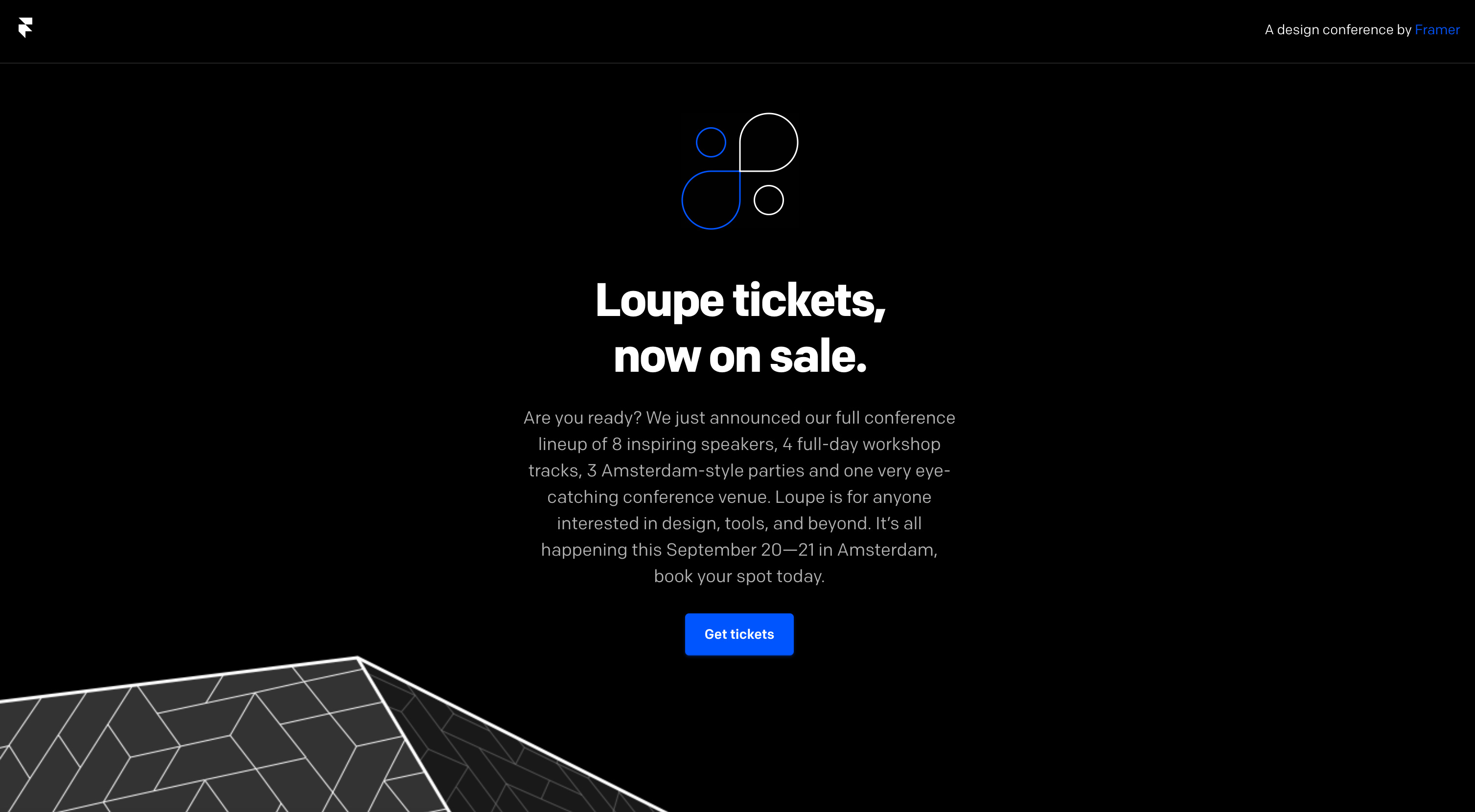
Loupe
Design meeting Loupe created a simple but effective campaign to announce the availability of tickets. This is one of my favorite dark email designs because of the use of a single bold color, negative space, and full width development.
Creative Boom
Creative Boom is an online magazine known for its lighthearted tone. In their weekly newsletters and other engaging content, they celebrate and inspire their own creative community.
Even with a white background, it’s nearly as good when they switch to a black design. Their content is flawless in every way.

Conclusion
Creating a consistent email design is difficult enough, but the addition of dark mode email features makes it even more exciting. Remember to follow the highlights used by different brands in order for your emails to look great.
By the way, to utilize the importance of dark mode design in technology, tune in this video from Whereoware to learn how dark mode is taking over the inbox. The video sheds light on what dark mode means for marketers and why subscribers are making the switch, as well as tips for designing, building, and delivering optimized, dark-mode-friendly email experiences.




Recent Comments