How to Maximize Your Responsive Email Design Efforts
People use their cellphones for the equivalent of a full day each week, and more than half of emails are opened on them. It’s essential to use responsive email design to increase campaign open rates and make it simpler for subscribers to respond to your emails.
In this article, we’ll discuss best practices, provide some advice on creating responsive emails, and show you one of our favorite old-school case studies.
Choose a single-column design
Multi-column layouts may be gorgeous on desktops, but they often get squashed or have parts scaled in ugly ways on mobile devices. Your information will remain organized, readable, and device-compatible with a single-column style.
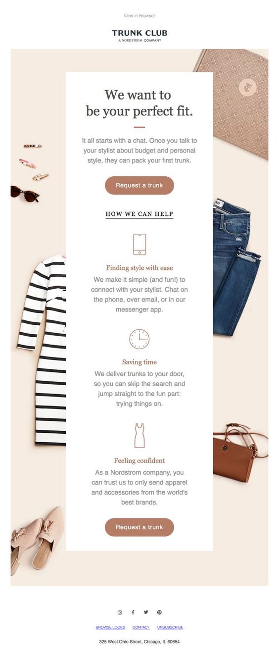
Trunk Club’s email employs a single-column design to ensure it appears fantastic on all devices.

Pick a simple, strong typeface
Avoid using delicate, tiny, or cursive typefaces. Anything that seems little on a desktop will become much more compact on a mobile device. Instead of straining their eyes, subscribers will just delete your email and maybe stop subscribing.

Avoid crowding connections
The irritation of attempting to click a link that is too near to another hyperlink has probably happened to most of us. Don’t subject your customers to it. Maintain a big font size, make effective use of whitespace, and provide enough space between distinctive hyperlinks.

Or just avoid using links at all
When connecting to your landing pages, employ buttons with vivid contrasting colors rather than text hyperlinks. Less is more when it comes to your links. Too many alternatives may overwhelm readers, leading them to “freeze,” and they may decide not to click anything at all.
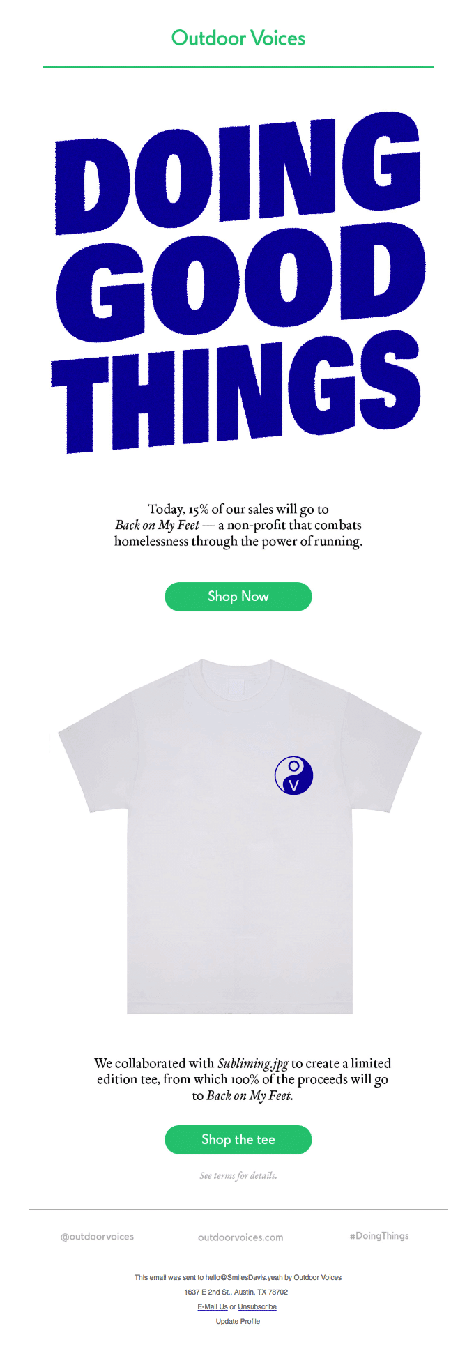
The strong typography, ample white space, brief writing, and eye-catching CTA button are all used in this email from Outdoor Voices.

Visualize images
Full-width, high-resolution photographs are often preferred by readers over tiny thumbnails. Make certain that your email templates will properly resize your lovely graphics and multimedia on each screen so they don’t get squished or stretched on the end of your subscribers. Make sure your enormous photographs won’t hog subscribers’ data or take too long to load.

Designing responsive email: Still worthwhile?
Absolutely. Your subscribers shouldn’t have to exert any effort to read and participate in your campaigns after they click that subject line.
Following email responsive design best practices is your best failsafe for avoiding significant code and layout errors that might make your email unpleasant or illegible, while there are never any assurances.
Low reader engagement translates into poor reader engagement, which translates into poor ROI.
Conclusion
Although it’s crucial to keep track of the email clients and devices your subscribers use, many subscribers are likely to read emails on numerous devices or transition smoothly between mobile and desktop. Spare your back while coding certain emails. To ensure that your campaigns always appear stunning, use a responsive email template and abide by these responsive email design principles.


Recent Comments