How to Write Your CTAs with Style
You’ve planned and designed your finest email campaign yet, and you can’t wait to send it.
Before you do so, ask yourself, “Did I remember to provide an actionable CTA?”
“Buy now!” or “Visit now!” are common CTA techniques. To make your CTA genuinely stand out, though, you must keep current on CTA writing and design best practices and devote some time to learning from exceptional, real-world examples.
Understanding how to properly construct CTAs
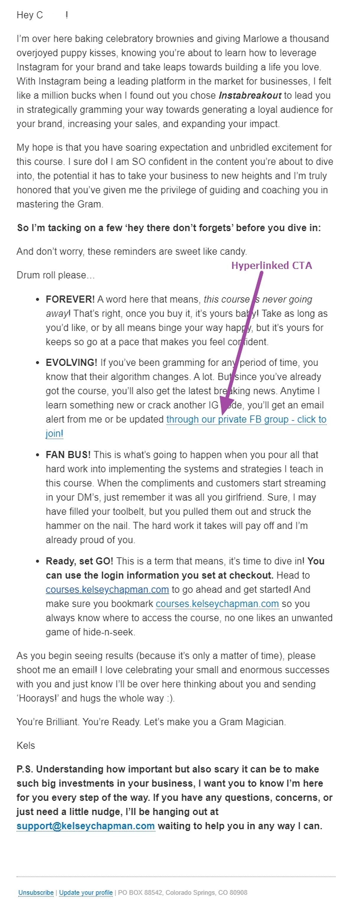
Email designers have traditionally given little effort to developing the actual CTA that appears inside the body of an email campaign. For many years, the writing staff was simply left to handle this since hyperlinked CTAs were the way to go.
For instance, consider this welcome email from social media specialist Kelsey Chapman.
As we enter the twenty-first century, technology and consumer habits are evolving. That is why it is critical to understand not just how to write but also how to construct CTAs. Here are a few key points to keep in mind:
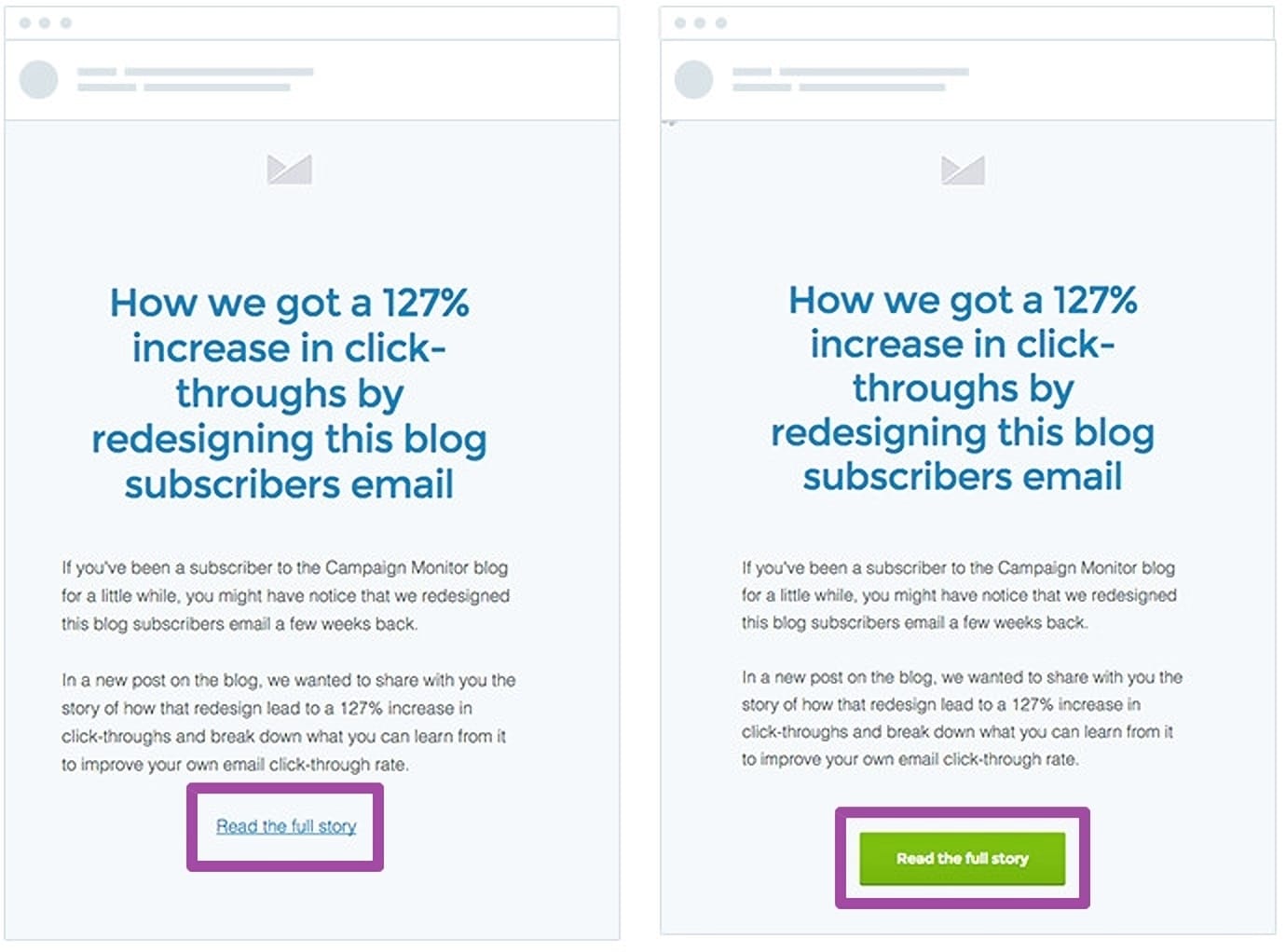
CTA buttons outperform hyperlinked CTA text
While hyperlinked CTA text is still a valid design choice, marketers have discovered that clickable button CTAs are preferred by customers over hyperlinked CTAs.
Make certain that your CTA is easily recognized
One reason why customers prefer clickable CTA buttons over hyperlinked text alternatives is because they are much simpler to discover. While having a hyperlinked CTA is still customary, many businesses keep the text in the same color as the rest of the email content. This makes speedy identification practically difficult.

Always include action-oriented language
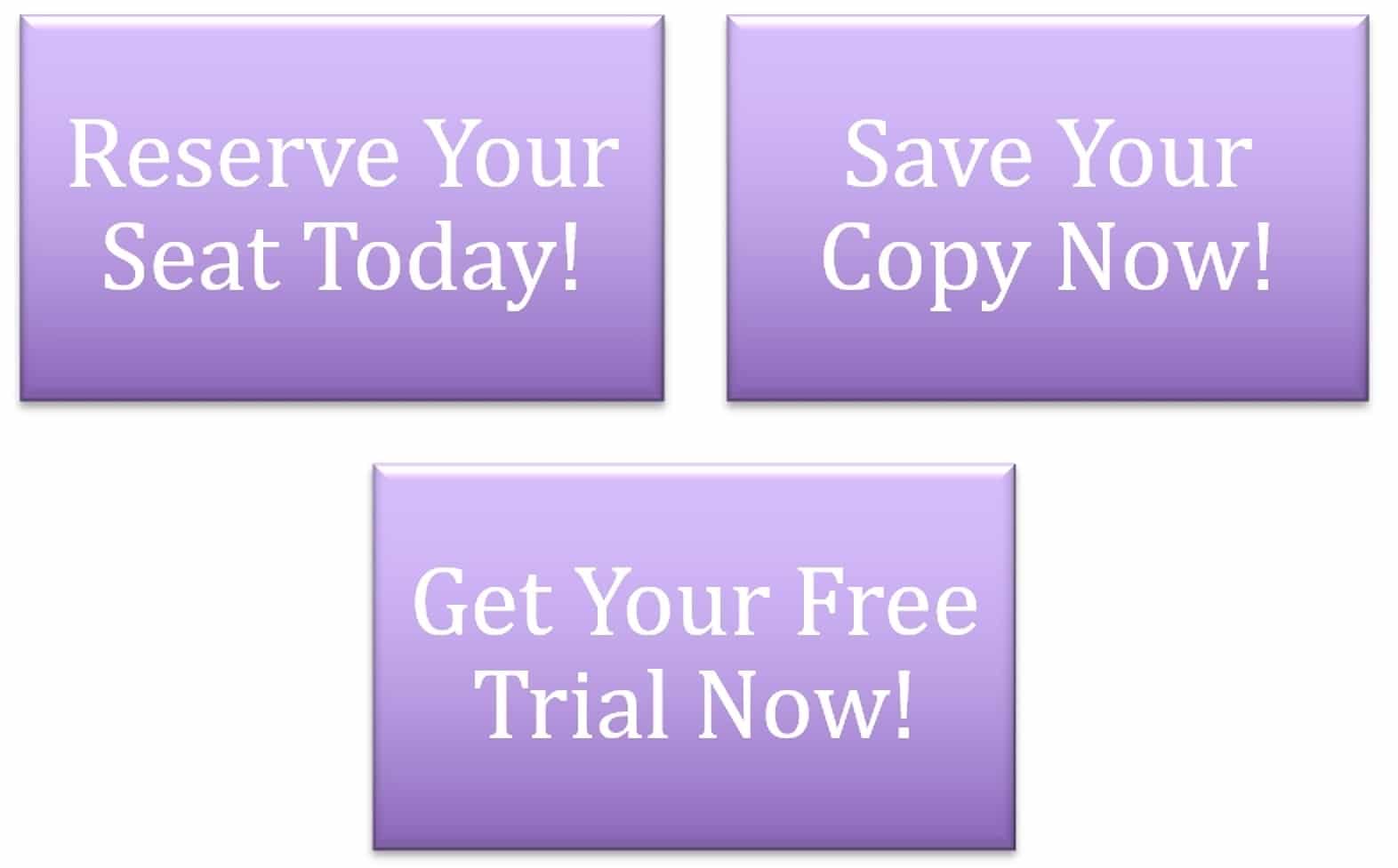
Keep in mind that the main purpose of your email marketing efforts is to generate action. The most efficient approach to do this is to include action-oriented wording inside your CTA at all times. Popular CTA action words include:
- Try
- \sBuy
- \sGet
- \sOrder
- \sReserve
- \sDownload
- \sAdd
- \sSign Up
- \sRegister
Avoid using “friction words”
While you want your CTAs to be actionable, you also want to avoid using friction terms. Friction words are phrases or words that indicate your reader must do something they may not want to do. Some examples of popular friction terms used in email marketing CTAs include:
Submit
\sOrder
\sDownload
While they are all practical phrases, they instruct the reader rather than encourage them. Here are some examples of how you can change your CTAs to incorporate frictionless words:
Download – Get
Order – Reserve
Apply – Learn
Breguet’s example of an actionable, seamless CTA
The CTA wording should be big and readable
When building your email CTA, we emphasized that it should be plainly visible. The most effective approach to do this is to ensure that your writing is both readable and large enough to stand out. That doesn’t mean you should make it annoying.
Consider Resy’s case. Because of the font and colour they used throughout the design process, their CTA is incredibly readable.
Resy’s email CTA is an example of a strong, short, and sweet CTA.
Keep CTA wording brief and to the point.
Along with a big, visible CTA, you should have one that is both short and sweet. Because your reader should already understand the advantage of clicking on your CTA, keep the wording brief and clear.

The CTA wording should be big and readable
When building your email CTA, we emphasized that it should be plainly visible. The most effective approach to do this is to ensure that your writing is both readable and large enough to stand out. That doesn’t mean you should make it annoying.
Consider Resy’s case. Because of the font and colour they used throughout the design process, their CTA is incredibly readable.

Keep CTA wording brief and to the point
Along with a big, visible CTA, you should have one that is both short and sweet. Because your reader should already understand the advantage of clicking on your CTA, keep the wording brief and clear.

In your CTA, using the first person/personalization goes a long way
It is no longer necessary to use the first person in your email CTA. It may even be as easy as stating “Reserve my seat” rather than “reserve a seat.”

Conclusion
Knowing how to create CTAs is an important component of the email marketing process. Again, if you want to see a return on investment from this marketing method, offer your email subscribers something to do.
When it comes to email CTAs, bear in mind some of the design and writing recommendations we’ve compiled, such as:
- Include action-oriented text
- Avoiding “friction words”
- Using a button vs. hyperlinked text
- Keeping it short and sweet
In this video you’ll learn how to create a call to action, that will increase your email campaigns click-through rates, and some tips on the CTA button design and its content.


Recent Comments