Five Email Marketing Campaigns with Fabulous Footers
Every email has a footer. When was the last time you considered your footers? Footers may not be the first thing that comes to mind when generating emails to send to your subscribers, but they are an important component of the puzzle.
The footer will not catch your readers’ attention before they open the email, but it may influence someone who is considering unsubscribing.
Continue reading to learn what your footer should contain, as well as some examples of outstanding email footers.
What exactly is an email’s footer?
The footer of your email, also known as the email signature, is positioned at the bottom of your email. This is normally the part of your email where you wish your reader well and offer your name and other essential information.
What should my email signature contain?
The signature is more than just your signature at the bottom of your email. Signatures are used to provide information about yourself to the reader. This often contains your name as well as some type of contact information, such as your phone number, email address, and website.
In reality, you may personalize your email signature in a variety of ways. Typical examples include:
Signature in plain text
These are traditional text-only signatures. They aren’t flashy and usually include just the most basic information, such as the sender’s name and sometimes a quotation or their company name.
Consider the following example from Team Beachbody. Their email signature is just “—Team Beachbody,” with no further information.

Signature in HTML
HTML signatures vary from plain text signatures in that they allow for more creativity. Users may personalize their email footers by changing the photos, colors, shapes, and links.
Keywee’s Chief Commercial Officer provides an example:

The sender sends a plain text signature with his name and position, as well as a URL to his website and email address, followed by a full-color logo/image.
Should your email address be included in your email signature?
No, it does not. It is just unnecessary.
When your customers or subscribers get an email from you, all they have to do is click “reply” to start composing a message back to you, thus having your email address in your email footer is just unnecessary.
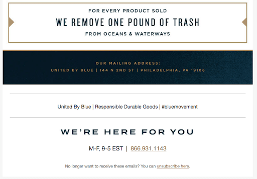
Share a motto, such as United by Blue
United by Blue provides dependable and long-lasting outdoor gear. Staying on brand, the company inserts its philosophy in the email footer. They also make it simple for their clients to contact them by posting their phone number and office hours. Everything is well-organized and simple to discover, and they have a hashtag to help people find them on social media.
Share your Moosejaw-like business personality
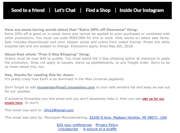
Moosejaw, a colorful outdoor gear manufacturer, is compelled by law to disclose information about their sales and clearance pricing. However, they stay on brand by playing with the phrasing and even praising their readers for making it that far down in the email. They also provide a link to their privacy rules, an email preference center, and a simple unsubscribe option. Furthermore, the link to a photo of a giraffe leads to an image of a giraffe.
Add images with Alaska Airlines
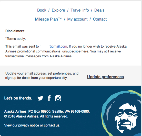
Alaska Airlines has added a lot of personality to the footer of their emails. They have a clear unsubscribe link and address, but they’ve kept with their branding by including colors and their logo. They also have a fun way of asking their subscribers to follow them on social media.
Include an email preference link, such as Patagonia’s
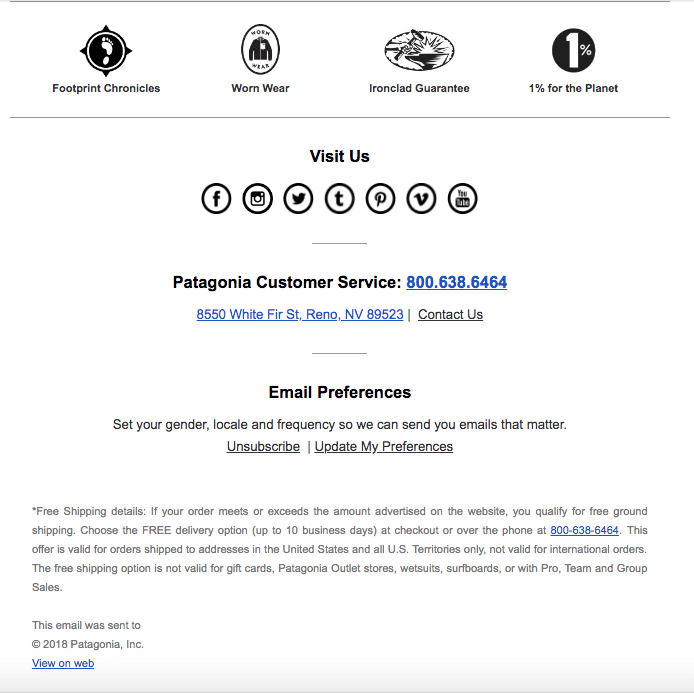
Patagonia features icons with connections to a handful of their programs, as well as several social media icons, to allow their consumers interact with them. They also have a wonderful message to encourage their subscribers to utilize the preference center, with the guarantee that they would then get the appropriate kind of emails.
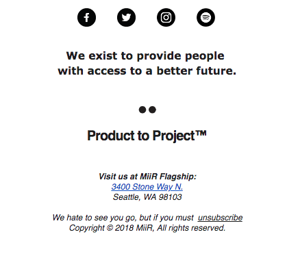
Share your company’s values, just like MiiR
MiiR, a water bottle and coffee cup startup, features a clean and simple footer with a compelling message. They provide all of the necessary information, but they’ve made their unsubscribe message welcoming and appealing. They’ve made a point of emphasizing their firm goal, reminding subscribers of who they are and what they believe in.
Conclusion
While footers may seem to be inconsequential, they may be improved to give your emails a boost. They let you to provide subscribers additional information about you and your brand, as well as opportunities for them to change their preferences and enhance their interactions with you.
Seguno Software still provides examples of email footers that work. Watch this video to learn how to enhance your campaigns and build your own using Canva.


Recent Comments