5 Great Examples of Scannable Emails
How do you go about reading email marketing ads that arrive in your inbox? Do you go over each and every word? Or do you scan them for something that may be of interest to you?
How do people read email campaigns?
People consume internet material in quite different ways than they do print or other forms of media.
Rather of reading an email like a book, left to right, word for word, research suggests that most users scan email messages in a F pattern.
Few individuals will read every word, instead passing through opening paragraphs and scanning the text for elements that catch their eye. If they come upon a piece that seems fascinating, they will dive right in.
Your window of opportunity to catch their attention is also limited, with 51 seconds being the average amount of time consumers devote to an email campaign after opening it.
Scannable email examples
When it comes to email length best practices, the scannability of an email is more important than the total length, at least in most circumstances. We indicated before that many readers scan an email campaign in a “F” pattern; however, it isn’t the only pattern to be aware of.
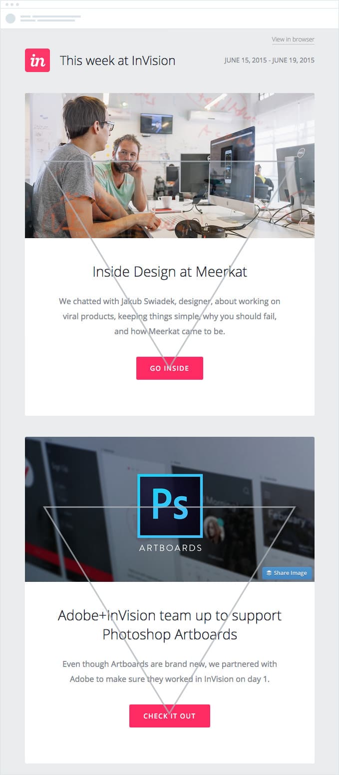
Now it’s up to the reader, but another interesting pattern is the inverted pyramid. This style leads the reader and directs them down the email from the top with a prominent header or graphic to a “point” or top of the pyramid, which typically brings the reader to the call to action.

The top 18 videos on Vimeo in 2018
Vimeo’s email is a great example of a speedy left-right scannable email. It performs an excellent job of directing the reader’s gaze in a regular reading pattern with the various color boxes and brief tidbits. The bolded subheadings in each box allow the reader to immediately see the subject of each section without having to read through it.

Jaybird
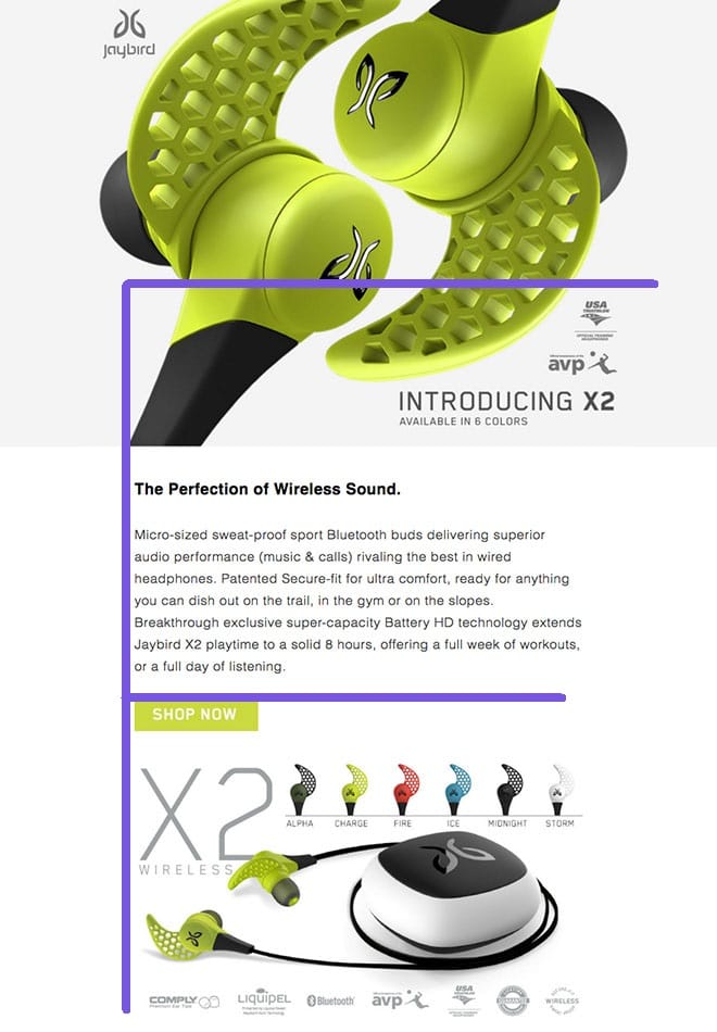
This email from Jaybird utilizes the “F” scannability pattern for its readers in an outstanding manner. The crisp left alignment and imagery utilized in varied alignments allow the user to swiftly navigate between the headline, text, CTA, and product photos.

Connections Highlights
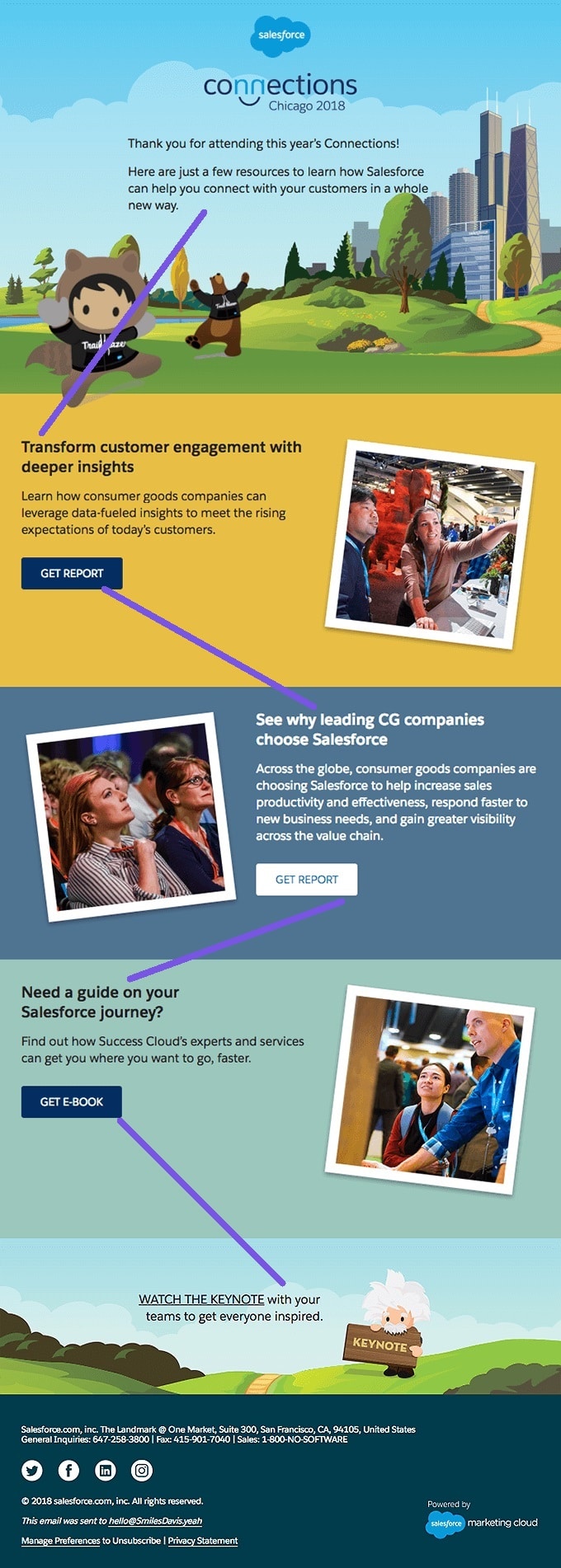
This Connections campaign employs the left-right pattern, but with additional whitespace in between parts, making it easy on the reader’s eye. In fact, as compared to the Vimeo example above, this Connections email is simpler to read due to the extra whitespace between each body of text and the accompanying picture.

Freshbooks
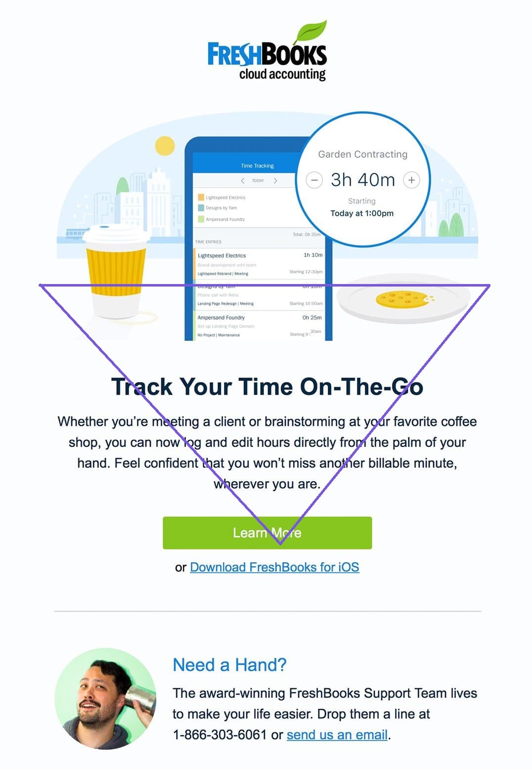
Finally, this email from Freshbooks makes good use of the inverted pyramid motif. Not only that, but they aren’t afraid to use pure whitespace to make the email simple on the eye while still giving useful material in a timely way.

Conclusion
Unfortunately for us marketers, consumers are so inundated with information these days that they scan emails, filtering out irrelevant content and only digesting what is.
However, by breaking down your messages into smaller chunks, prioritizing your information, and paying attention to how the words appear within your message, you can create email marketing campaigns that accommodate scanning readers and increase your chances of having your key messages read and remembered.


Recent Comments