Email-Safe fonts: How to Stay Compatible and On-brand
Every day, most individuals are overwhelmed with emails. As a result, you want your emails to stand out among the hundreds that your subscribers get. You could be tempted to be creative with your typefaces as well as your prose. However, it is critical to choose email-safe fonts to guarantee that your message gets sent and not flagged as spam. So, what are your options?
In this essay, we’ll go through how to stay on-brand while having almost no broken experiences. Continue reading to discover about email-safe fonts and how to choose the best ones for your company.
What exactly are email-safe fonts?
Email-safe fonts are those that will be accepted by all email providers. Using these fonts ensures that your subscribers can read your emails on almost any device.
According to Adestra, below is a list of email-safe fonts:
- ‘Arial Black’, Gadget, sans-serif
- Arial, Helvetica, sans-serif
- ‘Bookman Old Style’, serif
- ‘Courier New’, Courier, monospace
- ‘Comic Sans MS’, cursive
- Courier, monospace
- Georgia, serif
- Garamond, serif
- Impact, Charcoal, sans-serif
- ‘Lucida Sans Unicode’, ‘Lucida Grande’, sans-serif
- ‘Lucida Console’, Monaco, monospace
- font-family: ‘MS Serif’, ‘New York’, sans-serif;
- ‘MS sans-serif’, Geneva, sans-serif;
- ‘Palatino Linotype’, ‘Book Antiqua’, Palatino, serif;
- Symbol, sans-serif
- Tahoma, Geneva, sans-serif
- ‘Trebuchet MS’, Helvetica, sans-serif
- ‘Times New Roman’, Times, serif
- Verdana, Geneva, sans-serif
- Wingdings, ‘Zapf Dingbats’, sans-serif
- Webdings, sans-serif
What to Think About When Choosing a Font
You’re finished now that you’ve learned about email-safe fonts.
I’m joking.
As you may expect, selecting typefaces entails much more than just selecting one that is supported by all email providers. But isn’t that insane? Why not simply choose one and utilize it for all of your email copy? Your text just has to be functional.
However, it isn’t all an email typeface has to accomplish. It is critical to take a comprehensive strategy when selecting typefaces for your emails. Fonts are intimately tied to design, and hence to the entire appearance and feel of your brand.
Fonts are a visual indication to your viewers in the same way that imagery symbolizes your brand. While a reader may not notice a “nice” font, they will notice one that does not function well in your email.
In truth, there are many factors to consider while selecting the appropriate wording. Because typefaces are a visual key for your message, readers will use them unconsciously to judge your brand and what it has to offer.
- Consider serif vs. sans-serif fonts for your branding.
- Consider your audience.
- Think on legibility.
Many marketers are concerned with the little aspects of an email. Is the copy accurate? Are the links functional? Is the marketing performing as expected? Marketers, on the other hand, should consider the look and feel of their typeface, as any designer will tell you.
Serif vs. sans-serif fonts for your branding
Your typeface may differ significantly depending on the appearance and feel of your brand and message. Consider using a serif font if your company is recognized for conveying serious or noteworthy messages.
Serif fonts
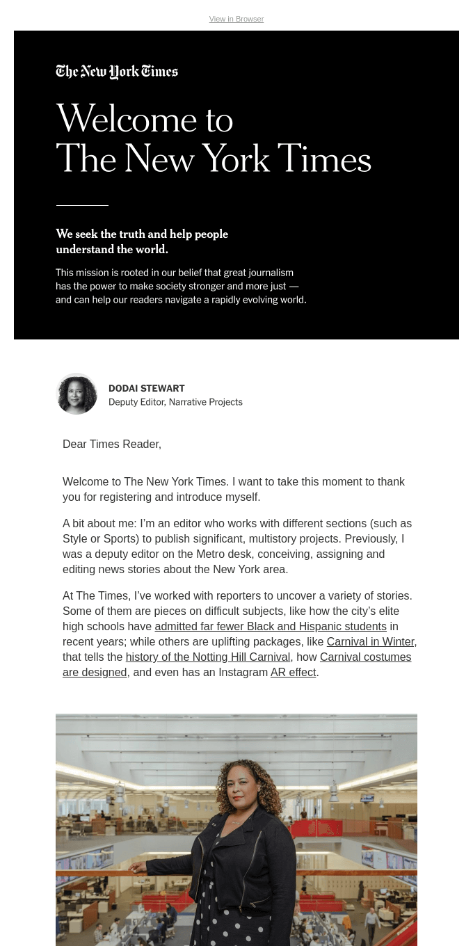
Serif typefaces are often seen in newspapers and long-form literature such as books or magazines. Even in its emails, The New York Times continues to use a serif typeface. This “serious” typeface gives their internet messages the same weight as their print products.

Sans-serif fonts
A serif typeface, on the other hand, may seem stuffy if your brand is more young or lively. In some instances, a sans-serif typeface may be preferable. Serif is increasingly popular in online publishing because of its clean appearance.
The email below, for example, advertises Venmo’s connection with Grubhub. These are two service-based businesses aimed towards a younger demographic. As a result, sans-serif is a more acceptable style. And, although this is an announcement, it isn’t very noteworthy, so sans-serif is preferable.

Using serif and sans-serif
While serif and sans-serif are diametrically opposed styles, try mixing them for contrast. This might be a risky decision for your email’s overall look. Furthermore, it might be an aesthetically appealing approach to direct readers’ attention.
You can see how Starbucks achieves this in the picture below. They choose serif font for their formal announcement. This style approach instructs readers to pay attention to Starbucks news because it may be significant.
They do, however, give scannable facts underneath the notice in an easy-to-read sans-serif typeface. Readers may quickly see the email update and then read the specifics if the news applies to them.

How to Get Ahead in the Font Game
But what if you’re dead bent on using a typeface that seems a bit hazardous in email? Is it necessary to forgo delivery capabilities for style?
Consider leveraging design to your advantage if you want to avoid using an email-safe font. Designing text right into your photographs is a brilliant approach to include typefaces that you would not otherwise be able to utilize.
However, don’t forget to add any relevant information in your content (in an email-safe font). This ensures that readers can view your content even if the graphics don’t display properly.
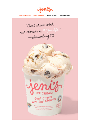
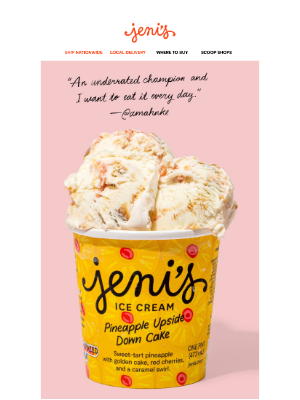
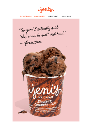
Take a look at how Jeni’s uses this strategy in the video below. At first sight, it seems to employ a range of typefaces, although the fonts used are relatively plain. However, hand-lettering is used in the design to provide aesthetic interest.
The hand-lettering also gives additional information about each ice cream. However, even if readers cannot see the photos, the message is clear: two new ice cream flavors are now available for purchase.


Wrap up
Fonts are an extension of the design of your email. Even little decisions, such as whether to use serif or sans-serif typefaces, may have a big impact on the entire appearance and feel of your message and brand.
While using email-safe fonts is always important, you should also consider your branding, your audience, and the legibility of your final email.
Consider using design to your advantage if you want your emails to stand out. For example, you could use a combination of serif and sans-serif fonts to guide your readers. If you insist on utilizing a non-email-safe font, try integrating it into your email’s imagery. Simply ensure that all pertinent information is included in the email content.
What will your emails look like now that you’ve learnt about typefaces (safe and otherwise)? Do you want to know how to get started?


Recent Comments