6 Email Newsletter Designs to Make your Email Visually Appealing
Email newsletter designs are vital tools for spreading your brand and reputation. You will be able to get more subscribers and followers by using these designs.
But how can you make your email newsletters more entertaining and knowledgeable?
Actually, there are many options. Let’s take a look at how brands are doing.
Away
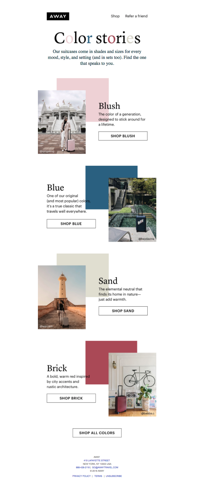
Away is a business that manufactures “smart baggage,” with the purpose of revolutionizing the archaic luggage and travel industries.
They put out a newsletter in which they inform readers about new product developments. This helps to showcase the product in a fresh light or to draw attention to a new collaboration or service.
In this case, they leverage material from social media users to showcase the colors of their items.
Jins
Jin’s ecommerce email is more traditional. They are mostly concerned with promoting merchandise and persuading customers to visit their business.
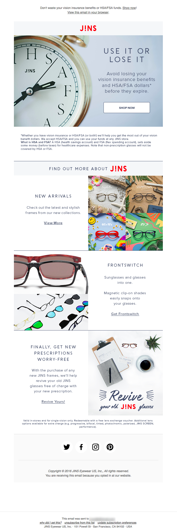
As you can see in the example, they direct the attention of their readers to key areas of emails by placing their CTAs in a hierarchical order. This may enhance conversions by emphasizing one core aim and a few secondary action items underneath.
They added their social media accounts at the bottom. This is an excellent approach to continue connecting with people across many platforms.
Unsplash
Unsplash is a platform for photographers to share free stock images. It allows users to share their work with marketers, media outlets, and anybody else searching for free stock photographs.
Unsplash’s advantage is that they issue two distinct newsletters. The first is sent out once a week and features chosen photographs, while the second is sent out once a month or so and contains information on new partnerships and other platform news.
Examine their email newsletter design:
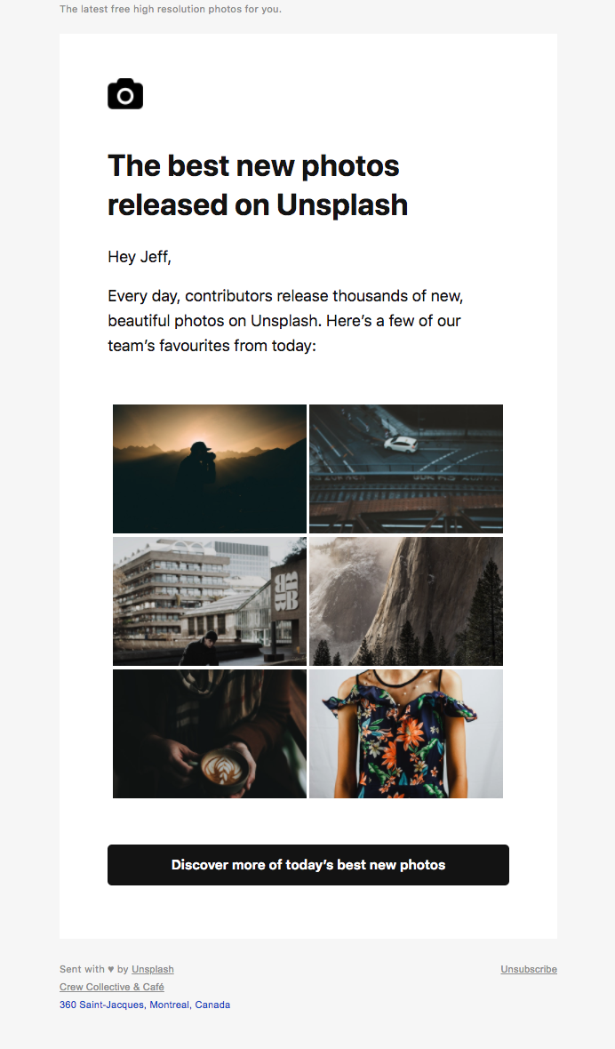
This is a very simple newsletter with curated images. This is a wise strategy especially when coupled with the beautiful images from their photographer community.

This is a second email that provides readers with information about their most recent fundraising and relationships.
Unsplash understands their target demographic, which includes a sizable number of bloggers. This consumer awareness is on full show with the prominent placement of their most recent Medium relationship.
Sendinblue
One purpose of a product newsletter is to notify consumers about new product features and urge them to use them. Overall, this Sendinblue email does an excellent job of informing and educating.
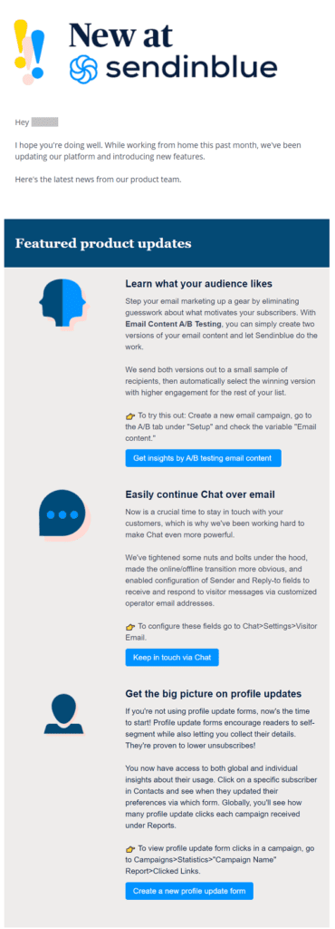
It begins with a distinct product feature section that highlights the most recent product features, each with its own CTA.
The second section comprises brief news tidbits.
Finally, the newsletter is still easy to read due to the proper mix of bullet points, paragraphs, and space.
PlayStation
Every week, PlayStation sends out an email to users with stories about new games, downloadable content, and other features.

They begin at the top with year-to-date statistics for the reader’s PlayStation system usage: trophies obtained and total hours played.
Really Good Emails
Among the brands, Really Good Emails offers one of the finest newsletters.
Their goal is to highlight outstanding promotional email campaigns and email newsletter designs.

The first thing you see is a dynamic GIF top with your name!! That’s incredible!
Ben Collins
The Ben Collins Blog newsletters are among the finest available. The site is entirely dedicated to Google Sheets and Google Data Studio.
In his emails, though, he takes a different approach. Rather from attempting to attract people to his website, he seeks to deliver value in the form of journalistic material and suggestions directly in the email.

At the bottom, he asks you to forward the email to anyone who might be interested. This is one of the most successful methods to increase your list naturally, so give it a go!
National Wildlife Federation
The National Wildlife Federation (NWF) takes a similar approach to newsletter design, although there are some subtle yet noticeable changes.

Their newsletter makes it quite obvious that they provide items designed to educate readers on issues related to their purpose of wildlife preservation.
They have a large CTA at the top that urges any new readers to subscribe to their newsletter.
They also add a contest in the midst of the email, which is an excellent method to increase interaction outside of the email newsletter.
Conclusion
Good design is essential for compelling people to read your full email and, even better, go to your website. You will be able to create something that your audience will like using the email newsletter design samples provided above in conjunction with best practices.
To explore of some other design ideas of your email newsletter, watch this video from Mike Ploger who dives into 12 email newsletter design tips that will help to boost your company’s email marketing results.



Recent Comments