How to Craft Strong Email CTAs that Get Clicked
Consider this: You created a lovely email with a fantastic subject line, an intriguing hook, and a pertinent offer. You press the “send” button and congratulate yourself!
What went wrong was that you did not optimize your call-to-action (CTA). It’s easy to miss these, yet they’re critical to increasing your click-through rates. Today, we’ll look at how to make email CTAs that will help you boost your email click-through rates.
Begin with your email’s final aim
Before you can begin developing your CTAs, you must first decide what you want users to click on. It’s a simple concept, yet it’s often overlooked before sending an email. You don’t want to find out your aim while writing your email; you want to start with your goal in mind before writing anything.
For example, Charity Water begins with an email that has CTAs aimed at familiarizing their subscribers with their organization.
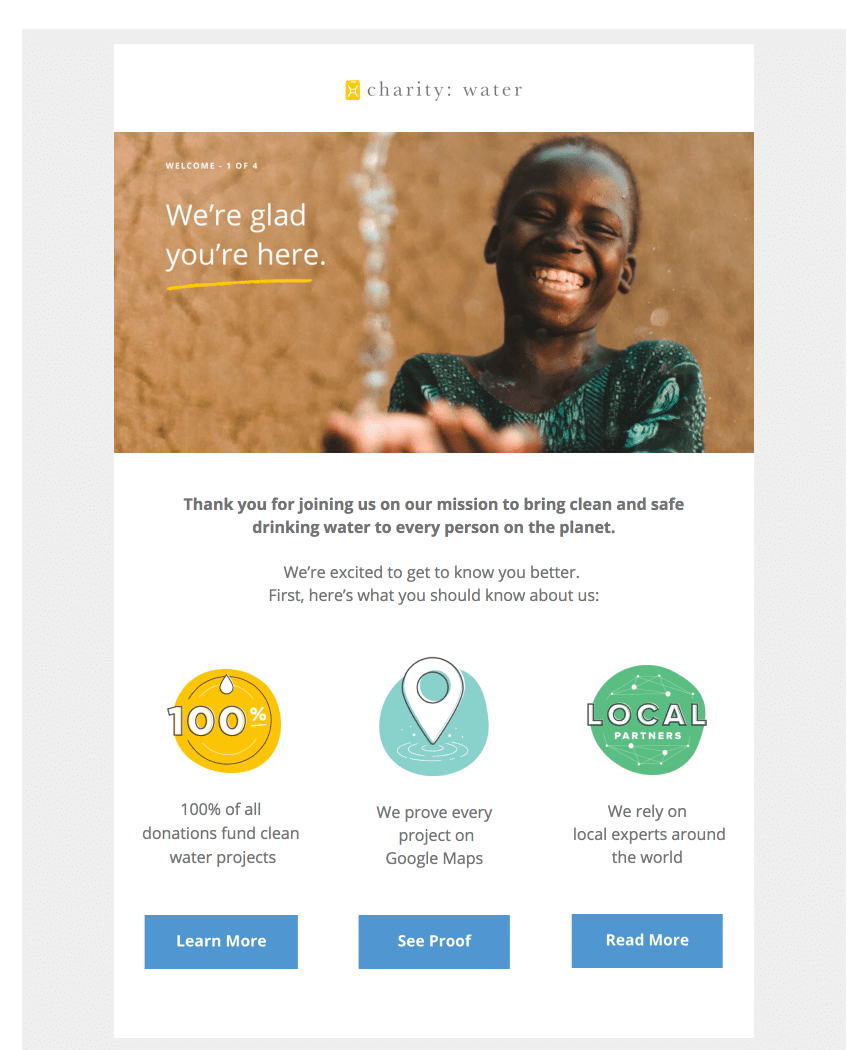
While having three CTAs is rare, they employ them on purpose to foster affection and trust with their subscribers. After a few emails, they send one asking for a contribution, which is their ultimate aim.

Steps to take:
Define the purpose of each email you send.
Write the CTA first, then the rest of your email.
Concentrate your email content and design on the CTA
Now that you know that every email should begin and finish with a goal in mind, you must concentrate on the email that leads to the CTA.
Every email should direct the subscriber to the next phase in their lifecycle. To do this, each part of your emails must connect with the final phase. It establishes your case in the mind of the subscriber before they reach the final CTA and stresses why they should click when they do.
J.Crew created the email below to direct its subscribers to the “25% off” deal. The typeface size, backdrop gradient, and language all work together to move you from being intrigued in their brand to taking action on their offer.

Artifact Uprising performs a similar thing with their survey email, but they add a really unique spin to it.
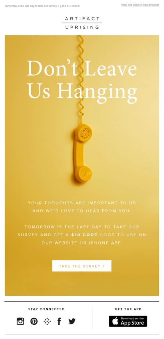
The telephone and the color gradient in this email visually direct you to the CTA. Furthermore, the wording above the CTA encourages users to complete the survey by offering a $10 discount voucher.
You may lead the subscriber to do more than just make a purchase. For example, Kabbage, a small business lending provider, wants to re-engage individuals who have joined up but have not yet requested for a loan by asking them to fill out a survey.
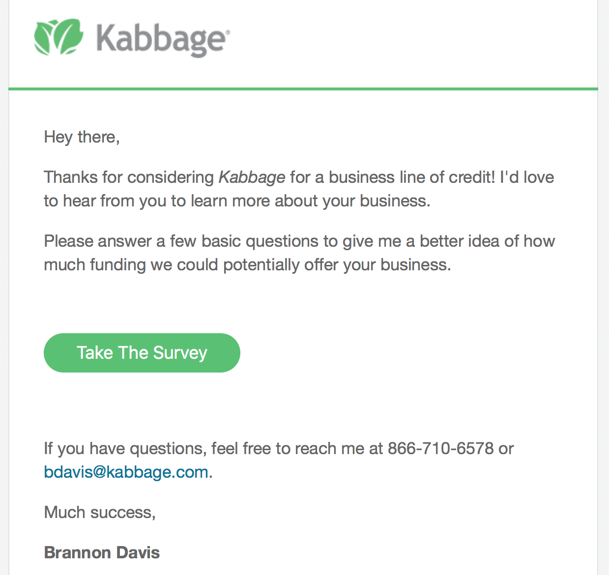
One of the major assumptions underlying behavioral marketing is that such an activity would enable Kabbage to classify the user and optimize the following round of emails.
Zoom, the video conferencing platform, hopes that users to register for one of their webinars. They perform an excellent job of concentrating the message by creating a feeling of urgency. This adds a sense of exclusivity to the CTA, making it more powerful than the typical “Sign Up” content.
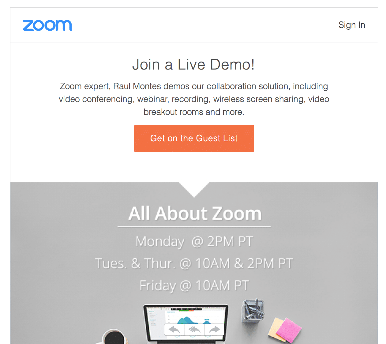
Steps to take:
- Concentrate your CTA on the aim you established in the previous section.
- Reverse engineer the email around the CTA, directing every piece of the email—subject line, hook, graphics, and storyline—to it.
Complement the message with the CTA
You need to match the former with the latter now that you know the purpose of each email and how to arrange the content around your CTA.
Previously, you saw how J.Crew and Artifact Uprising created a cohesive email that suited both the message and the CTA. In the email below, Banana Republic does an equally fantastic job:
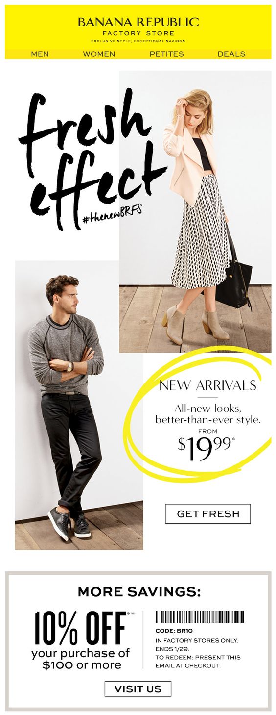
What makes this email stand out is that they used a color scheme—lemon yellow—that corresponds to the key idea: start new. They also utilize the phrase “fresh” twice, once in the headline and once in the CTA, which helps to make the whole email more unified and successful.
Madewell does an excellent job of toying with the notion of selling boots in the following example, using the picture and the CTA:
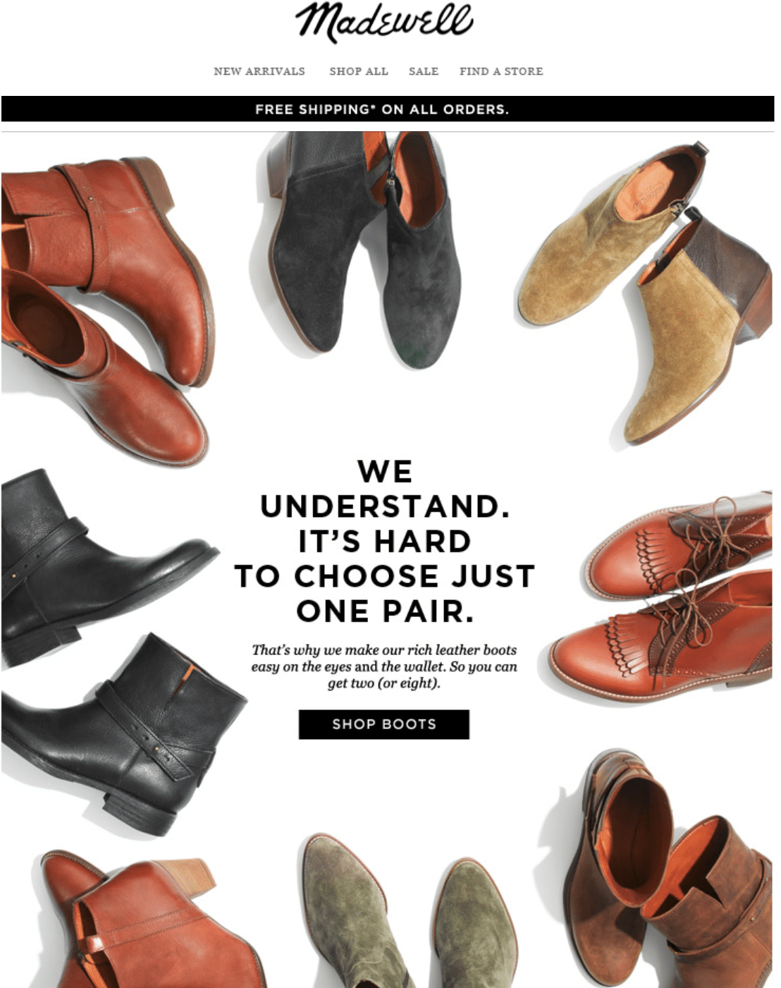
Steps to take:
- Consider how each piece links to the message and the CTA when drafting your next email. Experiment with several modifications until you discover the one that makes the email more powerful, as seen in the examples above.
Make use of copy that converts
While the CTA’s aim and the emphasis of your emails around it are important, CTA text may have a major influence on click-through rates. It’s simple to stick with conventional language (e.g., “Click Here”) or overcomplicate it with unnecessary text that distracts the user.
VRBO, the home rental service, aligns the notion of spending your next vacation in your ideal house with the CTA, which is centered on discovering the property, in the following email. The CTA reads “Find a Vacation Home” because they don’t want you to book just yet.

If they were sending an abandoned cart email, they could use something like “Book Your Vacation Home,” since it would fit the subscriber’s prior activity and purpose. However, in this email, the concept of “finding” a house perfectly suits the desired purpose.
J. Crew delivers another excellent email with an unusual call to action:
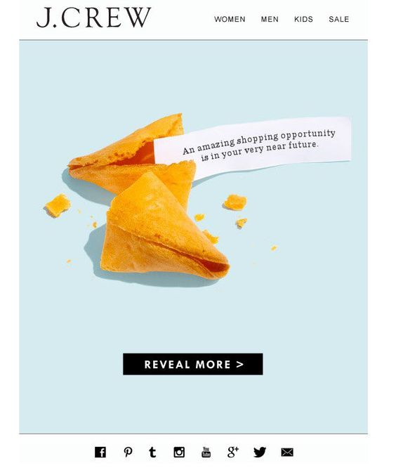
They begin with an enticing offer and end with the concept of “revealing” it if you click on the button. Using the term “reveal” is unusual, but J. Crew did it because they recognized it had a strong meaning in that context.
Using these “strong words” eventually boils down to writing text that entices your subscribers to click your CTAs.
Steps to take:
- Consider the preceding list of powerful words. Consider how you may use them in your next email.
- Stumped? Use Thesaurus.com to locate more terms that can assist you explain the importance of your CTA.
Always employ consistent branding and terminology
The essential phrase here is seamless, and your color schemes, graphics, and language should be consistent across your customer’s whole experience.
You never want your CTA to come off as spammy. The overarching objective is to have the buyer believe in your brand and identify it with your logo, vocabulary, and language.
Consider the marketing champion of toilet paper, Poo-Pourri:

Make sure your CTAs are readily converted to mobile forms.
Customers are more likely to click on an email marketing CTA if it takes them to an app that they already possess or can readily download.
Consider the following email from the music streaming service Spotify:
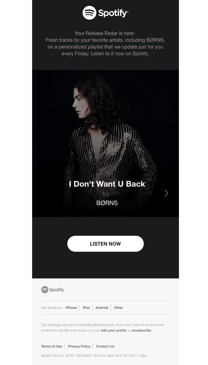
Their email exhibits top techniques for CTAs. Their CTA button stands out against their design backdrop and informs the viewer that they may listen to this musician right now.
Conclusion
The power of email is in the activities it inspires. You must specify your ultimate objectives in order to drive the appropriate behaviors. Once you know what each email will lead to, you must draw the subscriber’s attention to one CTA that corresponds to the core topic of your email. Using the knowledge in this piece, you should be able to incorporate CTAs in your emails that enhance click-through rates.




Recent Comments