How to Add a Fixed-Position CTA to Your Email Newsletters
You may provide people as much information as you want, but if they don’t act on it, your efforts will go unappreciated.
A few call-to-action (CTA) buttons may be required to stimulate greater interest in what you’re presenting.
CTA buttons are often used on websites to improve user experiences, but they are also used in emails to persuade users to leave their inbox.
Continue reading to learn how to include meaningful CTA buttons in your email newsletter.
Is it necessary for CTAs to be buttons?
No, CTAs are not required to be buttons.
CTAs might take the form of links, words, or graphics. CTA buttons are often used in emails since they are more visible and stimulate clicks. Readers are aware that they are intended to elicit a response.
When building CTA buttons for email newsletters, the platform is unimportant as long as you use wording that inspire readers to take action and the delivery connects with them.
Examine the samples of CTA wording, graphics, and links below.
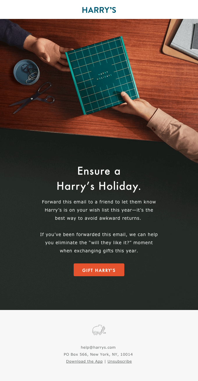

Best practices for CTA buttons
Buttons may be used throughout your email campaigns, but there are other methods to construct a CTA button.
Consider the following CTA button practices:
- Positions that are fixed
- Colors that stand out
- Action phrases
What is the optimal CTA placement?
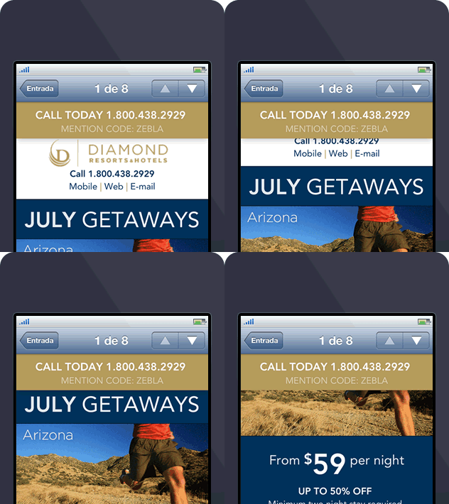
CTA buttons should be positioned in prominent locations.
Almost every day, we see web-inspired concepts adapted for email, such as Diamond Resorts International’s revolutionary fixed-location call to action (CTA).
The idea behind this strategy is straightforward. Because mobile device displays are limited, it is unlikely that any one component of the message will be accessible at all times when a subscriber reads an email. If, on the other hand, there’s a critical piece of information – say, a link or a phone number – that you’d always prefer to have on hand, you’ll need a cunning solution.
What colors work best for CTA buttons?
Colors of CTA buttons are essential.
Varied colors elicit different reactions from readers depending on their psychological responses.
CTA buttons in the same colors as your brand can help readers relate the reaction you’re seeking to your brand. To capture readers’ attention early on, use a brighter version of your brand’s colors. Complementary colors have also been shown to boost conversion rates.
Some of the more effective combinations are:
- Purple and orange
- Red and green
- Blue and yellow
CTA button color examples:
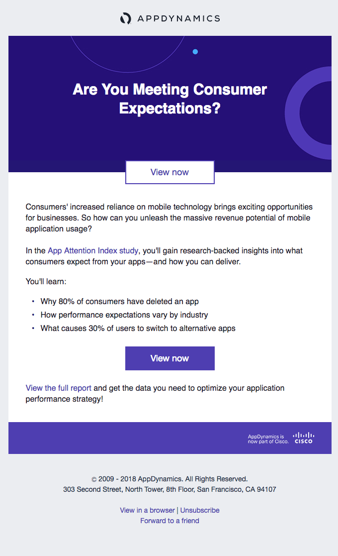

What are the best CTA phrases?
When designing CTA buttons, it’s critical to include action words that instruct users on how to continue.
When you use terms that instruct readers what to do, they begin to consider the scenario outside of their inbox and how they need your service/product to improve their lives.
For example, the email below employs a number of actions and alternatives.

Finally, some comments on CTA buttons
Simply by using deliberate strategies when building CTA buttons, your email campaigns may have a greater click-through rate.
Remember to play around with and explore:
- Verb-centered phrases
- Vibrant colors
- Placement
Begin upgrading and incorporating meaningful CTA buttons into your email campaigns, and let us know how they do.
Leave a comment and tell us how you use meaningful characters for your CTA buttons.


Recent Comments