7 Ways on How to Make Your Email Accessible to All Your Subscribers
Every day, as email marketers, we develop fresh and fascinating material for our subscribers.
However, if we do not adhere to email accessibility requirements, a significant section of our audience may be unable to read – or consume – our material at all.
Examine these email accessibility guidelines for copy and text components.
Leave out the irony, analogies, and sarcasm
People might be perplexed by some forms of humor, such as irony and sarcasm, as well as innuendos and analogies. It’s also a good idea to avoid any business jargon, abbreviations, or acronyms that don’t have clear explanations.
Copy should be clear and succinct
Short phrases, paragraphs, and bulleted lists may all be beneficial.
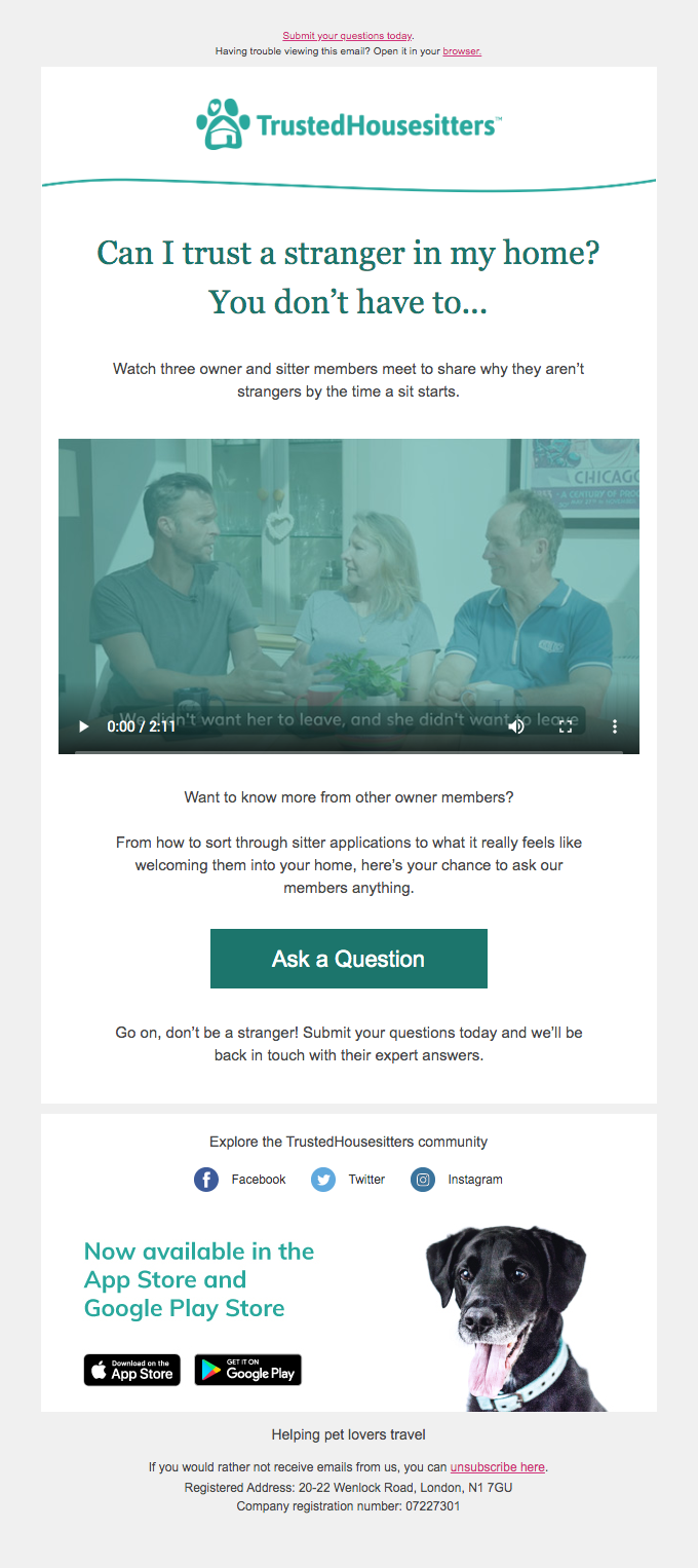
The text in this Trusted Housesitters email is brief and to the point. They’ve also provided alt tags, or text equivalents to their images.

Use a big font with a sensible structure
For persons with visual problems, a large typeface in a sans serif font is suitable. Meanwhile, using headers and a logical structure may help users skim for crucial information.
Coursera makes its emails more accessible by using headers, bulleted lists, and huge buttons.
Provide both plain text and web versions
Sending an email with a single huge picture is a no-no. Every email you send should contain a plain text version. People who use screen readers or other technology may also benefit from web versions.
Color contrast should be considered
Because millions of individuals suffer from various kinds and degrees of colorblindness, it is better to avoid using color to communicate information or explanations.
Tattly utilized alt text here, which is nice for screen reader subscribers, however the pink and gold might merge together into a single brown hue for colorblind subscribers.

Use big, visible call-to-action (CTA) buttons
Following this advice is also a good way to boost engagement. It’s critical to keep to one major CTA for each email campaign so that everyone understands what you want them to do.
With little language and a bold CTA button, MedPage Today went right to the point in promoting their podcast.

Include a lot of whitespace
Short sentences with non-justified text make it simple for individuals of all abilities to skim and read the content of your email. Because cluttered material might be misleading, whitespace is useful for directing a subscriber’s attention down the page, as shown in this email from Evenbrite.

Conclusion
Email accessibility guidelines are vital not just for increasing business but also for making the internet a welcoming environment for everyone.
In this interview, John Thies of Email on Acid and Dmitry Kudrenko of eSputnik discuss why email accessibility important, how to create accessible emails, and how to provide a better email experience to all of your subscribers, regardless of visual disability.


Recent Comments