3 Email Preheader Best Practices for 2021
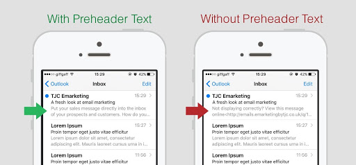
One of the fundamental guidelines is to ensure that a preheader is included in every single instance. In the event that you do not change this setting, the autoformatting feature of your email client may fill this field with a variety of sorts of text that are not productive. This includes providing the opportunity to see the email online, having a repeated subject line, or having the option to unsubscribe from the email list.

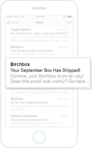
Introduce some humanity into the mix: by making a concerted effort to personalize as many aspects of your email as you can. A tried and true method for increasing the percentage of emails that are opened and read is to personalize the subject lines and greetings of the emails. The same may be said about the text that comes before the heading.

It is very necessary to create a one-to-one connection in order to boost the performance metrics of your email. There is clear evidence that showing some personalisation in the preheader can improve your results.
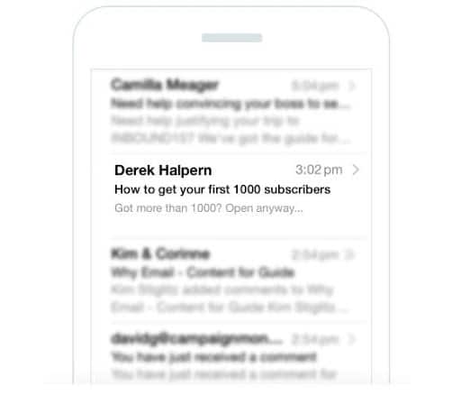
Ask a question: In order to engage receivers in a conversation, the subject lines of emails should always be written as questions rather than assertions. At the end of the day, “Save 50% Today” isn’t nearly as enticing as “Do You Want to Save 50% Today?” You may also utilize your preheaders to do this if you so want.

The above subject line does, in fact, make a statement; but, the follow-up preheader content does not. Instead, it poses a question to someone who may already have more than a thousand subscribers. Not just those who have a limited number of subscribers, but also anybody else who gets the email will immediately gain value from the communication.
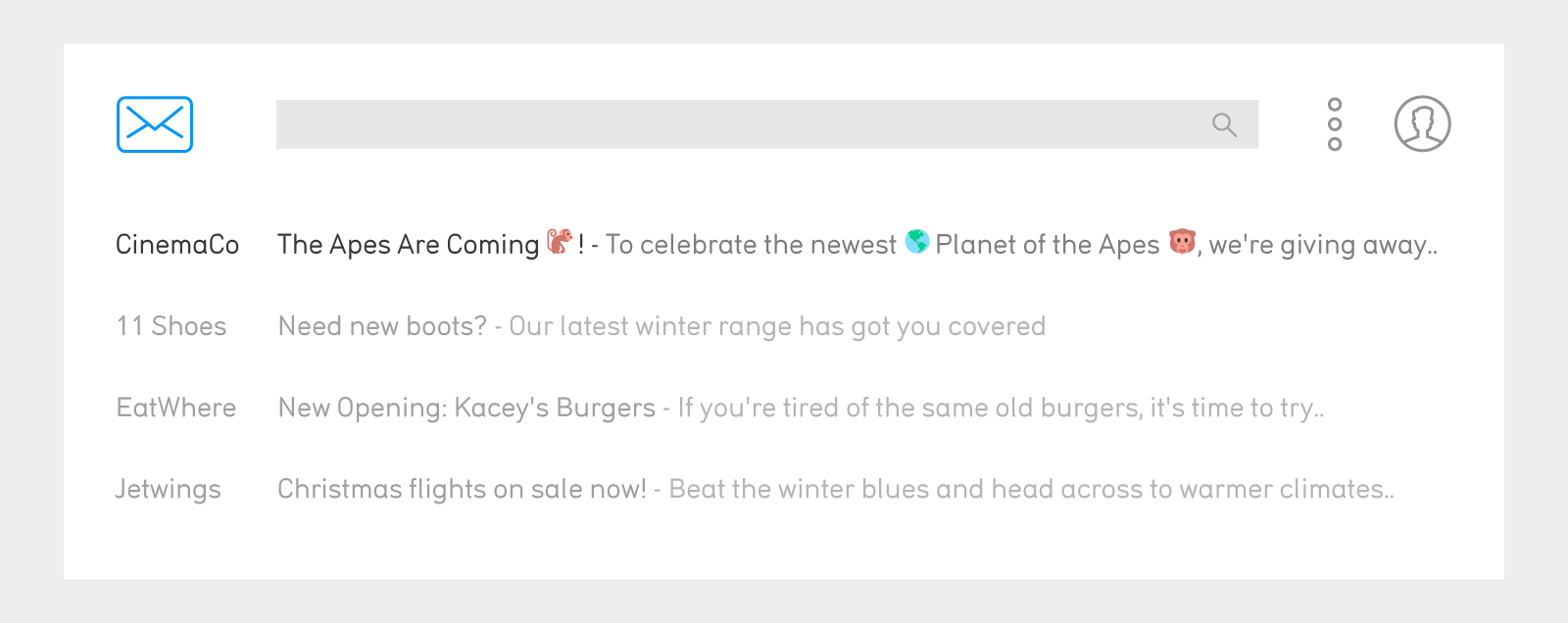
Emojis may help you stand out in a crowd: Emojis were once restricted to being used in short messaging service (SMS) messages; nevertheless, they have recently emerged as a useful tool in marketing email subject lines. Emojis may now be used in preheaders, as the example that can be seen below indicates. With the help of emojis, you may make your emails stand out even more among the many lines of text that are piled in an inbox.

In addition to their eye-catching appearance, emojis have a number of other advantages. For instance, on mobile devices, they pack a lot of power for communicating into the 30–40 characters that are normally permitted for each line of text.
Please check my email, Alexa
The nature of email marketing is always changing as a result of the rapid advancement of technology, and no list of “Email Preheader Best Practices 2018” could have predicted the state in which we find ourselves now. You need to take into consideration not just how the subject lines and preheaders of your emails appear on various devices and clients, but also how they sound.
The ability for users of Amazon’s Alexa Voice Service (AVS) to check their email was added through an upgrade made towards the end of 2018. This indicates that the way in which your preheaders sound while being read aloud is now of significant importance. In addition, the preheader problems that were mentioned before, such as repeating the subject line or defaulting to the unsubscribe option, would impair the efficacy of the email. This is in addition to any other accidental material that may be included.
Conclusion
Emails are an ever-present part of our day-to-day communications, which is a major contributor to the effectiveness of email marketing. On the other hand, this presents a problem in that your emails need to stand out among the other messages in a cluttered inbox. If you use each of the email preheader hacks that were discussed above, you – and your emails! – will be well on your way to achieving success.


Recent Comments