What are the Advantages of Mobile-First Email Design?
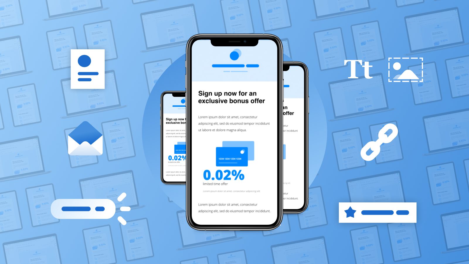
Email marketing is a business card for communicating with subscribers. Each person, opening a message, pays attention to the visual and then to the text. The structure and content of the email: graphics, illustrations, colors, fonts – all play a vital role in reading the email to the end and influence whether the user will take the action we want them to take. That’s why it’s important to remember that mobile accounted for 46% of email opens in 2018, and that number keeps rising. With that in mind, let’s consider the advantages of mobile-first email design.

Email design for mobile – main advantages
Impact of Email Design on Open Rate
The design of the emails will not directly affect the Open Rate – they will not be opened only because of the beautiful design. But this does not mean that you can’t invest in it. The brand, headline, and pre-header motivate the reader to view your Email marketing. But you can keep their attention with an unusual, catchy design. Powerful headlines will not bring traffic or increase CTR if there is a gray, nondescript letter inside. Of course, you can leave a button with an offer in it and still get clicks. That’s why brands make their mailings unique – they should distinguish the company from competitors and be remembered by the readers. For example, by using SEO services or digital marketing agencies to design your mobile-only email. They follow creative trends in popular culture and design. Such popular elements and directions will more easily resonate with readers.
Dark Background and Tint
White space in the writing field on mobile devices strains the eyes, while dark backgrounds give the eyes a break. The reader spends too much time on smartphone screens. You can take care of their eyesight and not strain them with mailings on a white background. White text on black is easier to read. You can customize a dark background on many sites and applications. Either way, an SEO consultant will help you with your mobile email design.
Ditching Templates and Columnar Division
Mobile Email marketing is often based on a table with two or three columns. This makes it easier to structure text and images. It is also convenient to set up a responsive layout so that the cells line up one after the other when viewed on a smartphone. But lately, brands have begun to favor designs with single space – no symmetry or columnar division.
Shadows and Semitones
Stock photos are constantly appearing on mailing lists from different brands. You can stand out and make a special email for mobile devices by working with the photo’s composition or changing its presentation. Try superimposing one picture on top of another. With the help of shadows and halftones, the image will become mobile, dynamic, and more impressive on the whole.
Custom Fonts
Arial, Times, Calibri are gradually becoming a thing of the past, although they are still found in mailing lists. But even modern fonts like Stolzl don’t always convey the tone of voice of the brand or the character of the letters. Therefore, hand-drawn fonts appear in mailing lists that make them playful, funny, and informal.
Minimalism
This trend is gaining popularity every year. People get tired of complex graphics and large designs. Companies are trying to simplify their product to convey to the user only what can help him. Many book publishers do this. A dark mode minimalist design might be able to help. The dark background of the promo and white text do not strain your eyes, and simple thematic images do not distract from the essence. You will only have to color the buttons to highlight them in the body of the letter.
Animated Graphics
GIFs and moving images add dynamics to writing and bring it to life. The animation will remain popular in mobile email marketing. But it should not overload the letter and distract from the content. GIFs will tell you about tariff changes or innovations in information messages, and in promo messages, they will focus on the offer and call to action.
Conclusion about mobile first email design
The beautiful and unusual design draws attention to the letters. Keep your messages minimal, don’t clutter your body, and leave plenty of space. This way, you can focus and direct the subscriber’s attention. But it doesn’t matter if you have a simple format, uninteresting text, and a non-engaging sentence. Spend your budget on SEO consultant services, and your emails can be effective with beautiful design.


Recent Comments