Email Design Ideas to Revitalize Your Email Newsletter
Do you think your emails might need a facelift?
Do you believe your subscribers are becoming tired of your campaigns? Perhaps you’re tired with your campaigns.
In any case, marketers must keep in mind that design trends shift.
We’ll go through some ideas for sprucing up your email newsletters and campaigns in this article. We’ll also provide you some cutting-edge email design ideas to help you catch people’s attention and increase conversions.
Keep these email design suggestions in mind
Design is important.
If your email doesn’t appear good on their device, more than 70% of your subscribers will trash it in less than three seconds.
Furthermore, 15% of consumers will just unsubscribe from your list instead of deleting the email.
In other words, with just one badly designed email, you have an 85% risk of losing existing and future visitors.
Make the most of every design you produce by using these email design ideas.
Don’t give up accessibility
Remember, you’re not creating emails to impress other designers. You’re creating emails to wow your subscribers. It is not a decent email design if it is not entirely accessible to everyone.
Keep the following principles in mind while designing for accessibility:
- Colors with good contrast and legibility.
- Hyperlinks of appropriate size and spacing
- Large font sizes and a legible typeface
- Avoid using flashing GIFs or movies that may cause a seizure or migraine.
- There is a lot of white space and the text is not justified.
Mobile is always important
Over half of all emails are opened on mobile devices, and this figure is anticipated to rise further.
The only way to guarantee that your emails appear good on all devices is to use responsive design. You’ll wind up writing infinite code for each email campaign if you don’t employ responsive design.
Furthermore, bear in mind that your subscribers may read your emails on numerous devices: initially on mobile, then on a desktop to make a purchase or take action.
Pay attention to your CTA buttons
People want CTA buttons to properly convey what’s on the other side of the link, according to Nielsen-Norman Group’s design research specialists.
Don’t be evasive. Phrases like “Get Started” or “Learn More” are insufficient for establishing trust with your subscribers. Customers find them deceptive, particularly when the landing page on the other side is not succinct.
Instead, use terms like “Start Shopping” or “RSVP Now,” and design landing sites with as few clicks and barriers as feasible.
Consider your backup design carefully
Keep in mind that your well created email design may not load on the end of your subscriber for a variety of reasons.
Perhaps they are blind and depend on text-based information with voice aid software. Perhaps they don’t want to use up their monthly data allowance by loading photos, so they change their email choices to text-only.
Regardless, many people depend on your backup information, such as alt-text, to figure out what you’re trying to say. Create a unified and informative experience for all users.
Put your customers in charge
Highly tailored campaigns are simple to build and deliver thanks to automation and configurable responsive templates. Instead of assuming your subscribers’ choices, just ask them.
In each email, provide a link that sends the subscriber to a website where they may change their email settings.
You don’t have to give them power over every design detail, but you may ask how often they’d want to hear from you, what sort of material they like, and certain design elements you’re unclear about.
Testing, testing, testing
To begin, you must do accessibility testing to verify that your emails appear as intended on every device and email software. Although Gmail and Apple’s iPhone dominate the market, they are far from the only email programs available.
As Huawei, the world’s second-largest smartphone maker, prepares to deploy their new operating system, testing and responsive design are more vital than ever.
Second, you must A/B test for user behavior and preferences to determine which email design concepts succeed and which fail.
Incorporate these email design ideas and trends into your campaigns to wow your readers and build eye-catching email newsletters that convert.
Content that is interactive
To stimulate activity and capture attention, interactive material does not have to be sophisticated or comprehensive. You can entice your readers to click around by just inserting a few short bits of interactive material in your emails.
Customers that interact with your content are 7 times more likely to make a buy. Furthermore, marketers claim that interactive content is 93% more effective than static material, which is 70%.
A slight bit of anticipation, like as this email from PRETTYLITTLETHING, may go a long way.

Accept minimalism
Minimalism is popular. Avoid cluttered layouts that include flashing visuals and overlapping components. Instead, direct your users’ attention to certain topics.
Make use of a single-column layout. Write succinct writing that gets to the point and piques your curiosity.
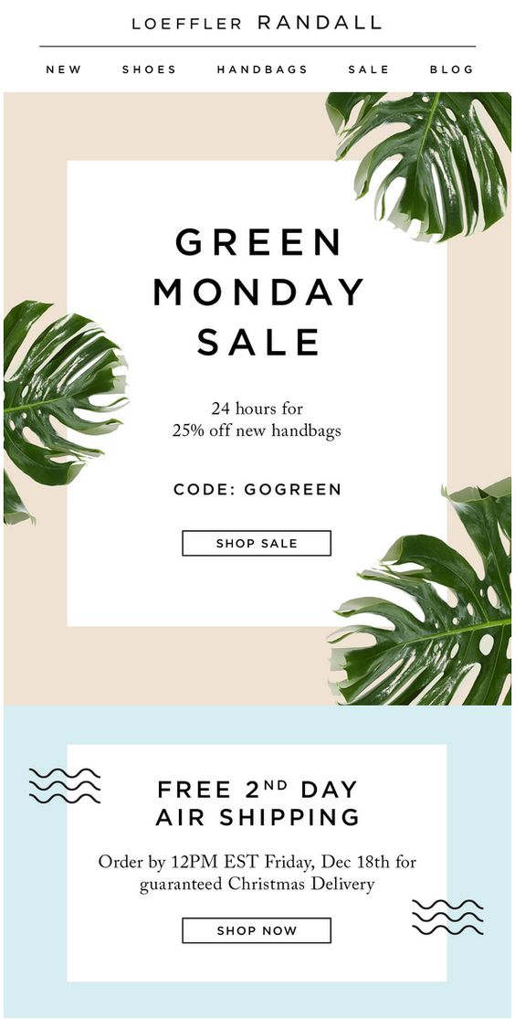
Loeffler Randall employed delicate visuals and just a few words in this email to draw attention to the content.

Personalized GIFs and APNGs
Custom GIFs work well for substituting video in emails. They load quicker and may be easily embedded into your ads.
Even better are APNGs. They have superior resolution than GIFs, load quicker, and are supported by major clients such as Gmail.
Remember that if your readers’ email program does not support GIFs or their internet connection is sluggish, they will only view the first panel as an image.
Gamification
Gamification, as Amazon discovered, is not ideal for every case. When utilized correctly, though, it may offer an unusual and engaging aspect to your email marketing.
With the appropriate coding, you can simply transform your mediocre emails into entertaining games.
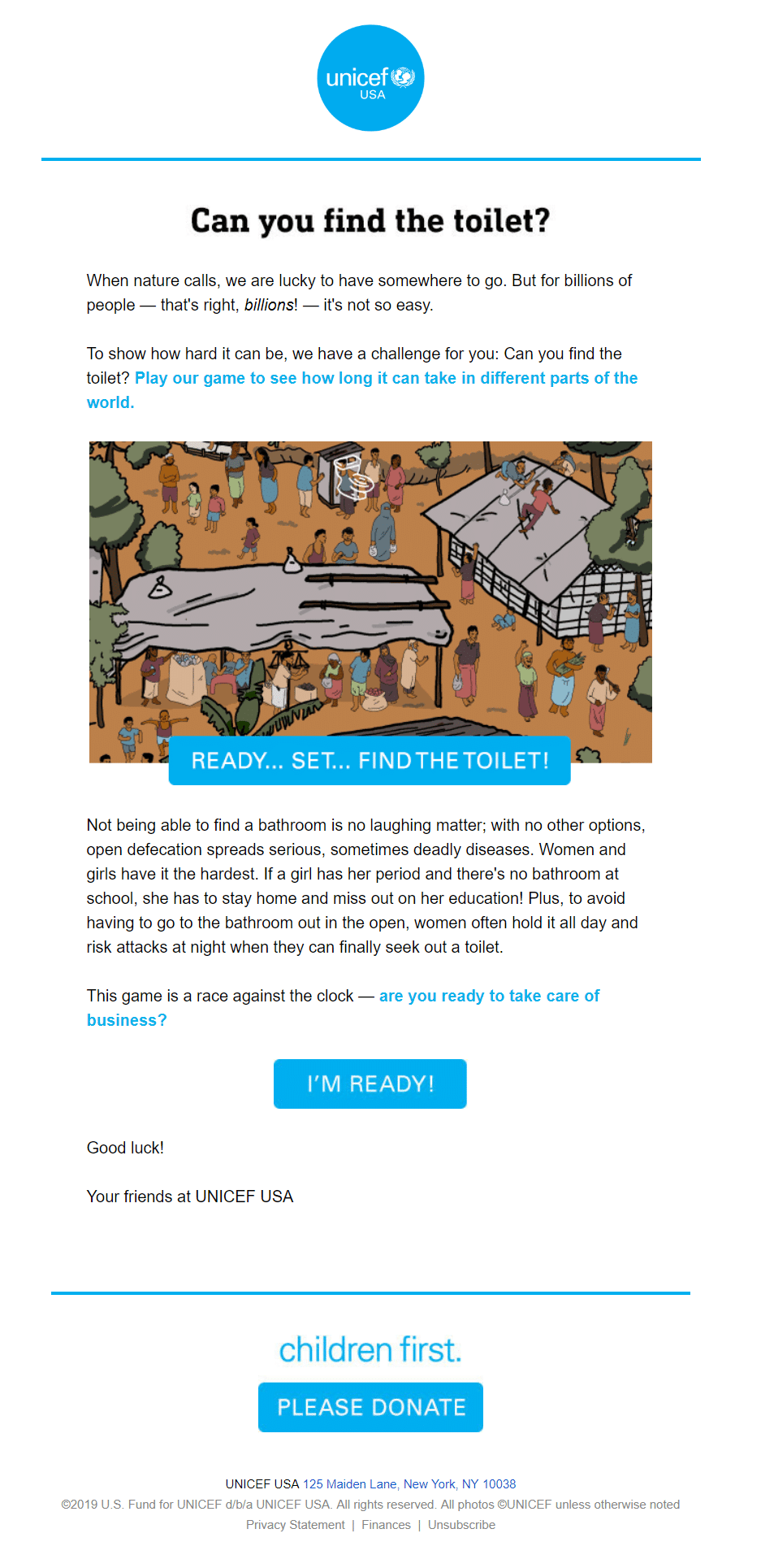
UNICEF has just updated its email style and content to incorporate gamified promotions. Despite the seriousness of the subject matter, the gamification is not insulting and instead calls attention to the problem mentioned in the email.

Landing Pages for AMP
You may spend all day crafting clear, actionable, and accessible emails—but what happens when your recipients click the link and get on your website?
In-email AMP browsing is currently supported by several popular email applications, including Gmail. Users may read the complete page instantly inside your email instead of waiting for an email browser and landing page to load.
Emails with AMP landing pages load quicker and lower the likelihood of subscribers abandoning their inbox before taking action.
Emails in monochrome and gradient colors
Monochrome or gradient color palettes are popular when it comes to minimalism. The straightforward colors bring attention to your material. When you restrict your color options, you are forced to be creative with your writing, picture content, typography, and contrast.
With this email, Kettle Obsessions employed a monochrome color palette. Examine the single-color pasted backdrop with black text and images in extreme contrast. Despite the fact that they employed a few colors, only one color is shown every scroll.

Live social feeds
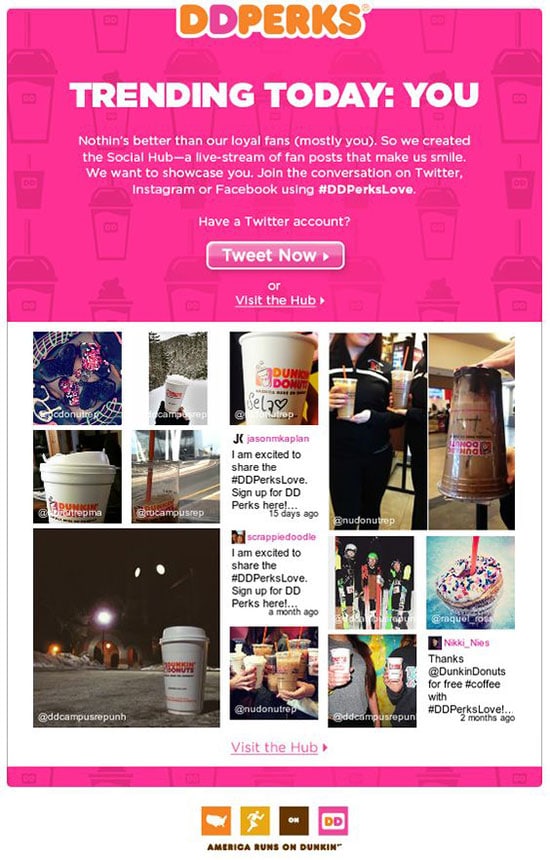
With advances in coding and CSS options, expect to see an increase in live social feeds this year. Integrating your marketing campaigns is crucial for building brand awareness and trust. Marketers need to make it easy for subscribers to connect with them on multiple platforms.
Notice how this Dunkin Donuts email campaign includes embedded social media posts from various platforms to encourage engagement across different channels.

Conclusion
Design trends shift all the time. As a result, it is critical to remember the following:
- Incorporate new design trends that are appropriate for your brand and content.
- Design for accessibility and usability, not for other designers.
- Conduct a large number of tests.
Outdated design might really harm the trust of your business. It is your responsibility as marketers and designers to remain on top of email design concepts and trends in order to produce campaigns that convert.


Recent Comments