3 Effective Nonprofit Newsletter Template Examples
Nonprofits play an important role in society. Every year, they raise around $358 billion.
Nonprofits must contact as many individuals as possible in order to continue doing this crucial job.
It has never been simpler to reach out and be recognized thanks to the surge in popularity of numerous technologies. However, when communicating with big groups, it is critical to have a template at your disposal to expedite your job.
That is why charity newsletter templates are in such high demand. When conceptualizing your ideal template, keep in mind that it should be adaptable so that you may use it for a variety of campaigns throughout the year.
Why does your organization need a newsletter template?
Newsletters are an effective kind of material. They are yours to own and modify, they are inexpensive, and they increase exposure and trust among your target audience.
Email marketing has several advantages for nonprofit organizations, including:
- The opportunity to expand your donation base on a local and worldwide scale.
- Having the ability to automate your emails reduces the amount of effort on your team.
- Allowing you to track analytics and engagement rates.
Still not convinced? The criteria listed below speak for themselves.
Nonprofits had the greatest open rates across most sectors, averaging more than 25%, as well as strong click-through rates and click-to-open rates of 2.60% and 10.30%, respectively.
It’s not simple to stay relevant in your audience’s email. It is critical to communicate consistently without overwhelming your audience. This is why you should send out email newsletters on a regular basis.
Knowing what makes a good nonprofit email is simply the first step. It’s now time to look at some nonprofit examples that stand out from the rest.
1. The World Wildlife Fund
The World Wildlife Fund (WWF) understands how to manipulate its audience’s emotions.
The adorable animal is the first thing that sticks out in the illustration below. This entices its subscribers, and once they begin reading, they get immersed in the narrative of a young cub and the perils he confronts.
Finally, the following text encourages readers to take action:
“Needs you right now.”
“Are you willing to assist?”
“You can assist!”
“Take action immediately to defend our planet’s life and halt threats to nature.”
This mix of emotionally charged terminology and images strongly motivates the reader to take action.
This example is strengthened by the fact that the WWF personalizes its emails by including their subscribers’ names multiple times throughout. Instead of asking supporters to give mindlessly, the WWF is asking “John” to assist in making a difference.
2. UNICEF
This example from UNICEF, like the WWF, uses both words and pictures to elicit emotion and convey a narrative. Instead of presenting the tale in the email’s body, they allowed the shock value of a few selected phrases and visuals do the hard work.
UNICEF employs a very basic design in this example that focuses the picture and moves the reader’s attention away from the sorrowful youngster and toward the CTA: “Find out why.” This CTA is engaging since the reader will be curious as to what happened to that youngster.
The sentence “water is harmful” is also included in the top graphic. This sentence incites fear in the reader, prompting them to ponder how it’s harmful, which brings them directly to the CTA.
Takeaway: When it comes to successful charity templates, less is more sometimes. A captivating image or phrase will pique readers’ interest and increase CTA clicks.
3. Patagonia
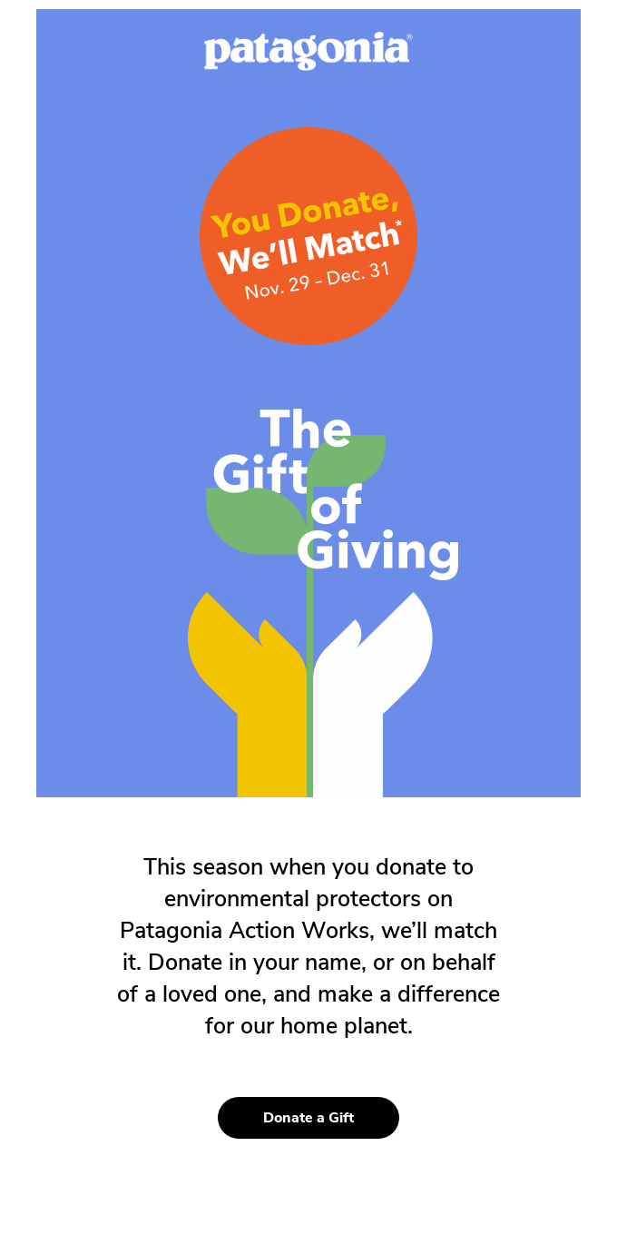
What distinguishes this Patagonia template example is the way it puts the reader at the center of focus. While Patagonia is not a charity, they are a company that utilizes its resources to help others, particularly when it comes to environmental protection.
Instead of emphasizing on their own efforts, the authors of this email go out of their way to highlight their subscribers and the good they can accomplish. This email focuses on locating the brand’s loyal audience by personally addressing the reader. Each of their CTAs is short, simple, and to the point, urging readers to take action right away. The graphics used also depicts young people participating in different initiatives.

Takeaway: You don’t have to include the subscriber’s name to personalize your charity template. You may draw attention to your readers by utilizing pictures that are relevant to them and their interests. The trick is to make it relevant enough that they want to participate.
Wrap up
When it comes to selecting the correct parts for your charity newsletter templates, keep the following in mind:
- Personalization
- Storytelling
- Vocabulary that is appropriate
- CTAs that are actionable
- Imagery that is relatable
- Design that is appealing to readers


Recent Comments