Why You Shouldn’t Send Image-Only Emails to Your Subscribers
Everyone has been there. You intended to create your most colorful and imaginative newsletter for your customers, but things did not go as planned.
Sending image-only or image-heavy emails may seem to be a good idea at first look, but they might provide a bad subscriber experience and eventually harm your brand. A picture may express a thousand words, but sometimes the words must be spelt out.
Here are some of the reasons why sending image-only emails isn’t always the ideal option for your campaigns.
If your subscriber has images disabled, they will not see your email
Many readers may not see photos because of a default setting in their email software or a personal choice.
While many email programs now display photos by default, images off is still fairly popular in regulated areas where corporate filters automatically block images. Blocked graphics may cause emails to fail to communicate instantly, fail to make an effect, or even seem to be broken.
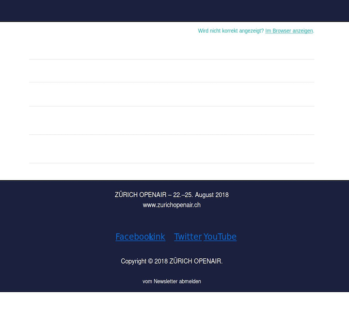
For example, the next two screenshots show the same email — with pictures turned on and off:
Images in emails

Email with photos attached

Customization choices are restricted
You can make unique visuals, but it takes a lot more time than making personalized text. Setting up targeting criteria in your email platform would also be far more complicated than utilizing merge tags in your text.
Consider the following scenario: you wish to utilize simple first name personalisation. Can you envision making a unique graphic for each name on your list? No. Way.
Because of the size of the email, it may load slowly or not at all
Images in your emails may load slower than usual if your subscribers have a sluggish internet connection or are connecting to data on the move. Even if a person has a fast internet connection, photos may not load quickly enough.
Here’s one from the Farm-To-Closet newsletter:

The longer it takes for photos to load, the more probable it is that your subscriber will get disinterested and delete your email. And if your email just contains photos, this may have an impact on future interaction with your business.
Images may not scale down to mobile screen sizes effectively

There’s a lot to consider when it comes to mobile email design. Images designed for mobile might seem overdone on desktop. If you don’t use retina pictures, your desktop designs may seem fuzzy. And what if the picture has text? It may seem too small on the little screen.
Your emails will be unsearchable

People often utilize their inbox as a storage location. They may recall something useful or important in your emails, such as a great deal on a product, that they need to discover again later. But what if you put all of your writing in images? Your website’s content is no longer searchable.
Image-only emails are costly to produce effectively

Time is currency. It is expensive to have someone spend the time crafting a gorgeous all-image email—including all of the back and forth discussed above—just to modify the text on it.
Conclusion
It’s OK if your image emails may need some tweaking. The best approach isn’t always the easy way, but taking the effort to make your emails inclusive to all readers with as much live text as possible provides a fantastic subscriber experience and saves you time and money in the long run.
Aurelius Tjin discusses whether you should send plain text emails or HTML emails as part of your email marketing plan in this video. You’ll discover the benefits and drawbacks of each, as well as which format to employ in your email marketing depending on your purpose and company. Finally, these email marketing strategies will only go you so far. Following email marketing best practices is always a good idea. Your email marketing should be tested and tracked. Track your openings, clicks, and other analytics to see what works and what doesn’t.


Recent Comments